The Power of Mobile
My Situation in 2016
I have lived in Los Angeles now for nearly three years and never owned a car. I don't need to with apps like Uber, Lyft and the metro system. Although not perfect I have been able to get around and explore quite a bit of the city. It's amazing what stores you might find if you just walk a little and add, let's say, 15-20 minutes to your journey. There are a great deal of benefits to taking public transport, a stress-free commute to work, you can plan your day and even do some work if you need to if you are taking a longer ride. However, There are some things I would like to address in this blog post that I feel other commuters of Los Angeles will relate.
A few months back I had a rather frustrating experience getting the bus from A to B. I was actually so annoyed I took it upon myself the next time to document the entire experience from the moment I woke up to the moment I got to the store.
Something may already be in the works (I hope it is) or out there that has already streamlined the experience but I’d like to provide some ideas of my own based on the particular journey I had.
The Data
As I started to think about this blog post, I wanted to take a look at some passenger statistics to see if it was true that more and more people are turning to public transport because of traffic issues in Los Angeles as the conversation has been brought up in the past with other fellow commuters. I was wrong. In fact, it's the opposite, and there is a steady decline of passenger boardings year on year since 2013. This is quite alarming.
The chart below shows the decline year on year:
I would love to know why this is happening. Now one could speculate that metro passengers are getting frustrated with the bus experience like I did, perhaps more people taking uber/lyft because of the simple and convenient experience? Perhaps it's easier to just get a car and deal with the traffic?, who knows, it was interesting to see these statistics and i felt it gave me more of a case to create this blog post.
The Journey
When creating an experience, it is vital to actually put yourself in the shoes of the user and understand the experience first hand. Below is a visual journey of myself experiencing the bus service in Los Angeles.

Mapping the Experience
Below is a diagram showing my end to end experience of taking the bus from the moment I woke up to the point in which I exited the bus. I brought my phone with me and documented the experience and how I felt at each moment. As you can see at a high level the only time I was truly satisfied was before I got on the bus and after
A Post Service Observation
As I exited the bus, I noticed something. It occurred to me that everyone except one person was on their phone. I have highlighted this with the white circles.
After a moment of clarity, I brought it upon myself to talk to some of the commuters about their experiences taking the bus. Firstly I introduced myself and explained that I was working on a project to do with improving the metro bus system, then asked: “What are your thought’s on the metro bus system?”. “It kinda sucks” one of them said. A common theme amongst the answers was not knowing when the bus would arrive, this seemed to be everyones biggest frustration. I thanked them for their time and headed to my destination.
Survey & Results
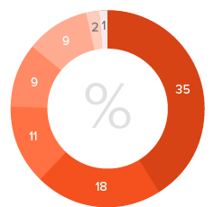
I began to think about how I could quickly reach a larger audience. I am a huge fan of Reddit, and one particular subreddit I discovered was r/samplesize. You can post surveys and the community will provide feedback, this was perfect. I put together a survey in google docs and submitted it to the subreddit. Within a few days I was clearly starting to see that other people were experiencing the same frustrations as me. I realized I wasn't alone on this. Just to note that this wasn't LA specific. I received answers from people all over the US.
Please take a look at the results below:
My Approach
Ideation
Once I had mapped out the emotional journey I was able to visualize all the moments involved. I could clearly see some pain points I encountered along the way such as waiting for the bus, and not being able to sit down as no seats were available. My experience went pretty much downhill from the moment the bus showed up. I was already frustrated that I didn't know when the bus would arrive and then to stand for another 30 minutes?, it wasn't ideal.
Sketching the New Experience
As I analyzed my research, I started to sketch out some ideas for a simple mobile app that could help improve the metro bus experience. You can download the sketch templates from POP here.
No Onboarding
After some initial sketches, I felt I had enough to start creating a low fidelity prototype. Sketch is an excellent design tool that let's me quickly create mock ups. This enables we to drop the screens into either invision or Proto.io, add a few clickable hot spots to show interactions between screens and then I would be able to start gathering feedback. I will touch on this later.
I thought about situations in the past where I have needed to quickly see how far away my bus is so I thought it would be a good idea to drop the user straight into the interface with just one location notification. This would allow the app to drop a pin exactly on my current location and I could start the process of finding out where my bus is.
The screens below show how the app would function after the user has downloaded it:
'Where’s My Bus' - Beacon Technology
This is the next part of the app that I felt would be most useful. I thought about apps like Uber and Lyft and how they use beacon technology to show you where cars are in relation to your location.
I began to think about how bus drivers of the future would have a mobile device that would clip into a holder on their dashboard so that all data could be passed through the device such as seat sensor information, passenger information and potential passengers waiting to be picked up at the next stop.
Integrating phone ibeacons or googles location API on buses would also allow passengers to see exactly where the bus is, a live feed if you will.
Another idea I had around this was that it would be cool if the user could activate the stop alert on the bus when it’s within 50-100 yards of the stop. I have been in situations in the past where an empty bus has gone past me without stopping as the driver perhaps didn't see me due to a large parked truck before the stop. Making the driver aware I'm at the stop would be extremely beneficial.
Here are some screens that show how you could simply and efficiently see where your bus is based on my thoughts and ideas above:
Boarding the Bus - QR Code Scan Integration
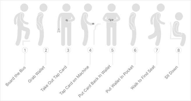
The diagram below shows all the moments involved in me boarding the bus on this particular journey. As you can see there are quite a number of steps just to board a bus.
This was my experience:
As I mapped this out I started to think about all the steps involved, reaching into my pocket, grabbing my wallet and then taking my tap card out of my wallet to tap the tap card machine. I just felt that there must be a more streamlined approach so I asked myself, how I would do this differently if I could just use my device?. So I started to think about how Starbucks customers use their app to purchase coffee and ultimately this lead me to a new streamlined experience for boarding the bus.
The diagram below shows the optimized experience I came up with:
Here is an example of how it could work in the app:
Blue Tooth Tags/Smart Sensors
I thought about how sensors built into the seats could track pressure so data could be passed to the drivers phone and then onto people waiting for the bus so they can see how full it is upon arrival. This sets the expectation upfront as opposed to finding out as you walk on the bus there is no seats and have to stand. Sometimes it’s quite hard to see at the back of the bus even when it is quite busy so I usually just end up standing for the duration. However, knowing that there are spare seats I would be more likely to go to the back of the bus.
This information could easily be displayed on a phone much like the American Airlines seat selector.
Here is an example of how it could work in the app:
Tap Card Integration & Payment (Existing Users)
The Diagram below shows how just a simple QR code on the front of the tap card could be used for existing users to add their allowance or pass type to the phone. You would simply take a picture with your phone and the details attached to the card will automatically sync with the app and you won't need to use the card again. If you didn't have a card in the first place you could simply set up an account through the app without having to use a ticket machine.
Here is an idea of how it could work in the app:
Closing Comments
Based off my research, feedback from fellow commuters, friends and colleagues, I feel that these simple ideas could heavily improve the LA metro bus system and, more importantly, increase the number of daily boardings. This was an extremely enjoyable process, I hope those of you who took the time to read it could perhaps share some of your experiences in the comments section below or perhaps provide ideas elaborating on what I have done so far. Who knows, maybe metro might see this and be inspired, they also may not but right now the experience of getting a bus in LA is not ideal.
Perhaps 'Uber Bus' may not be too far around the corner, and if an experience like what I describe is coming to Los Angeles I would be the first to jump on the band wagon.. literally..
Basically, the way I see it, if you are paying for a service or experience you deserve a pleasant one.
Cheers.


