Control Panel B2B
INTERNAL INNOVATION
Something goes here
The vision
With mobile/tablet in mind, we will strive to create a robust touch friendly admin application that will work in conjunction with call center reps to help serve the needs of our customers and internal employees to administer their website profiles such as an address change or a fund transfer. We will create predictable, simple and beautiful interactions that will avoid confusion and be scalable when call representatives are controlling the customers account entitlements of their specific products such as life insurance or an annuity.
My Role
Stakeholder Interviews | User Research | User Stories | White board/Ideation sessions | User Flows | Site Map Architecture | Wireframes | Interaction Design | Prototyping | Consultation with development
Teams Involved
UX/Interaction Lead | Project Manager | Visual Designer | Business Analyst | Development Team | Security Representatives | Legal Representatives
Tools & Technology
Omni Graffle | Axure | Adobe Illustrator | Sketch Template | Usertesting.com | Morae (Moderated testing - Desktop) | Lync Screenshare (Tech Consults)
What Was In Place
A system that was heavily outdated which ultimately led to a poor experience for the call representative.
Methodology
Below is the diagram of my approach to responsive design. I strongly believe that the three main drivers are content, usability and performance. Based on these three drivers, I created a lean approach that is currently being used for the project. It is extremely important that collaboration and communication with developers is apparent within this process from day one.
Discovery
Analysis
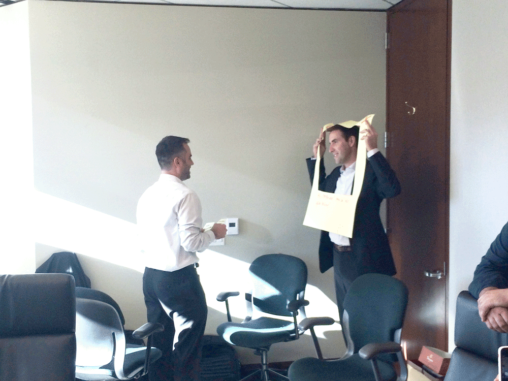
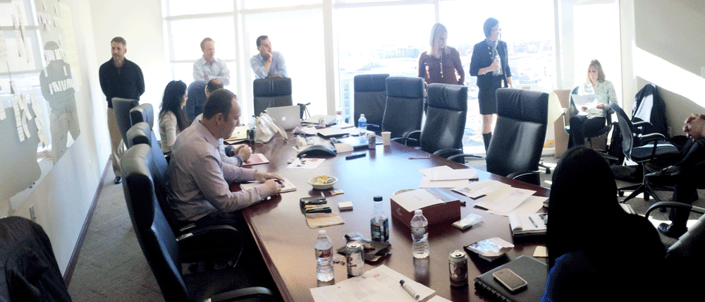
Conducted Stake holder interviews and held meetings with call representatives and engineers, anyone that could influence the end to end journey, the aim was to find out the pain points for the company and customer call representatives based on feedback. From this we were able to put ourselves in the minds of the call reps and identify the main areas of concern.
Definition
Ideation
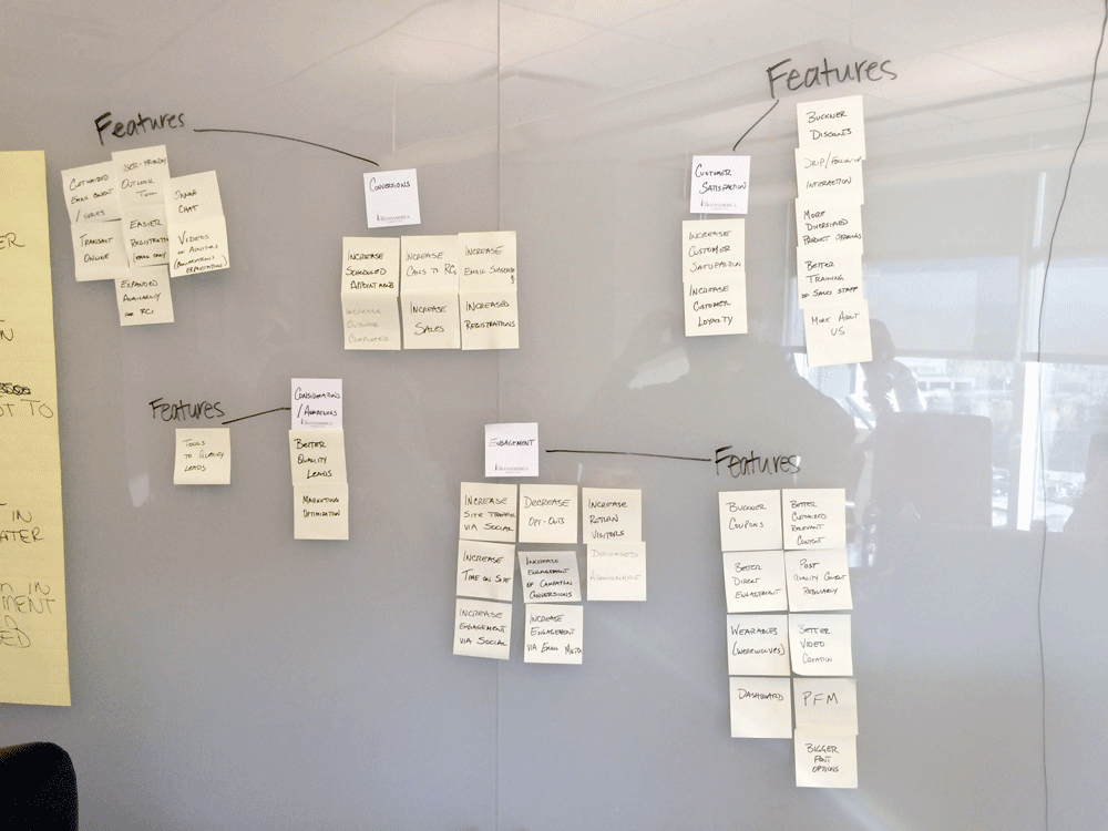
Using the insights we gathered from our working sessions, we were able to update our personas and surface potential risks in the use cases.
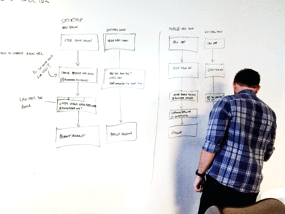
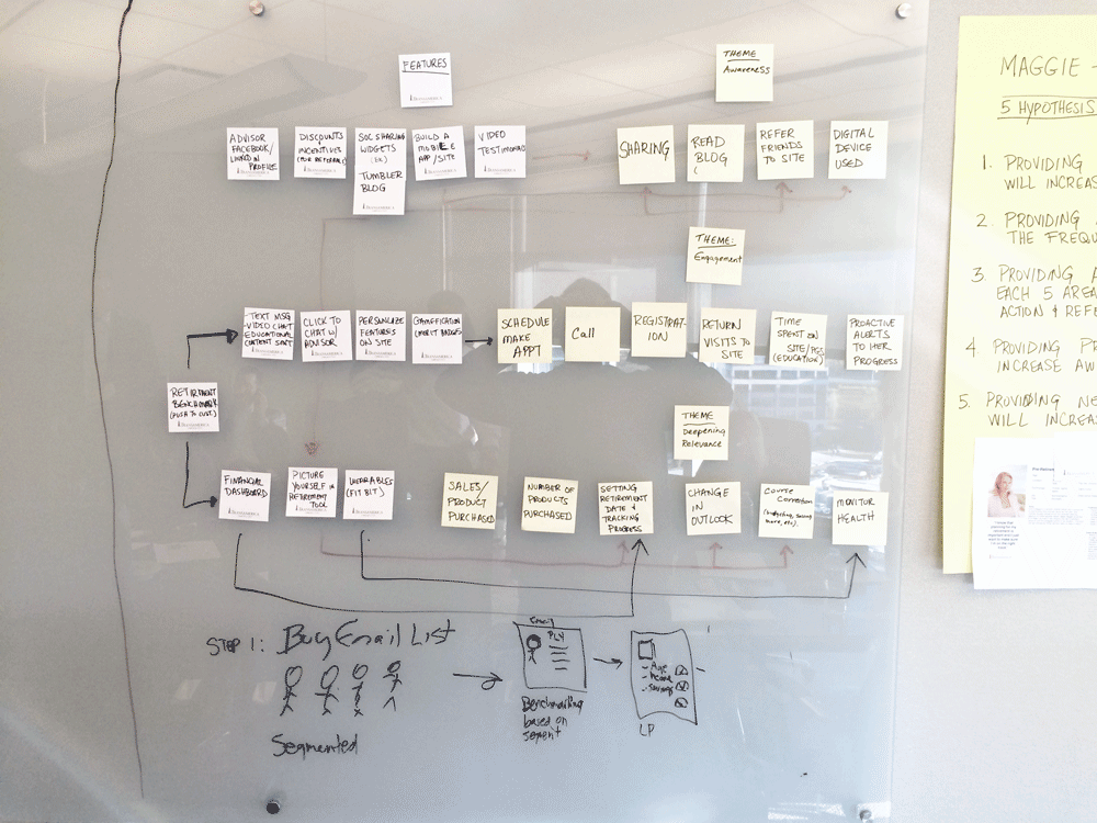
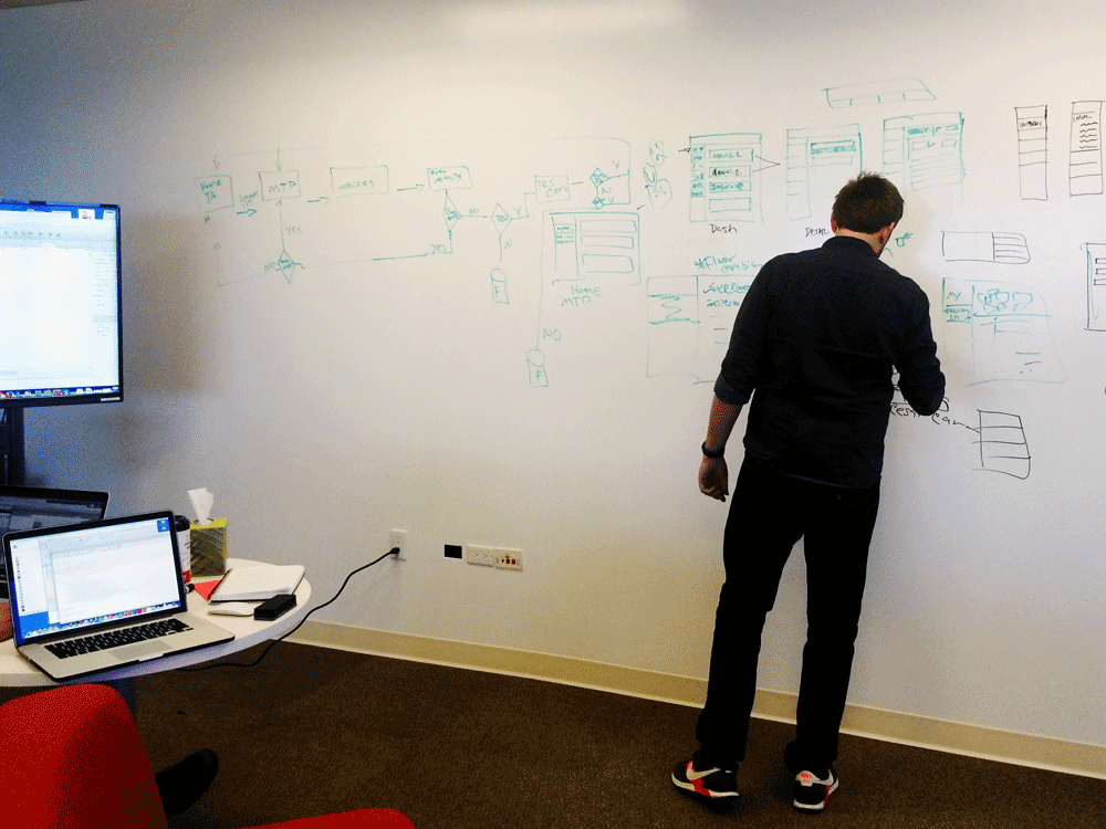
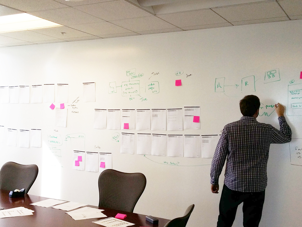
From here we were able to start journey mapping and exploring experiences from an emotional standpoint so we could bridge the gap between the customer and the call representative. Using the white board made it easier to put all our thoughts and ideas together to solve these experiences.
UX Architecture
Traceability of the requirements was extremely important. Especially of a project this size. A great deal of thought and effort went into making sure the documentation was holistic/high level, and once the architecture was in place, we were then able to start the ideation phase.
Design
Interaction Design
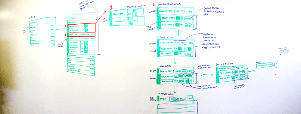
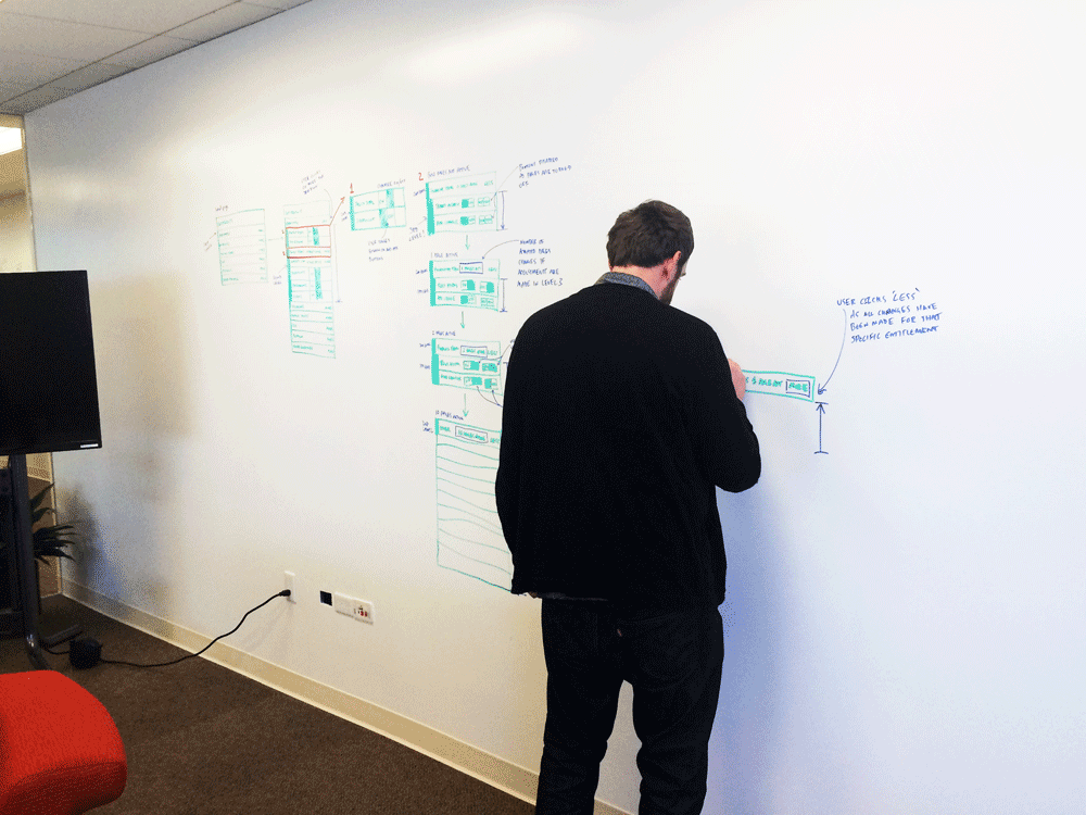
Once the architecture was fully vetted it was time to start ideating. This is where myself and the UX team began sketching on the white board. From here we were able to build interaction models and process flows. This is evident in the images below. Solving this problem was extremely complex in regards to the functionality and how it could be responsive to ipad.
Wireframes
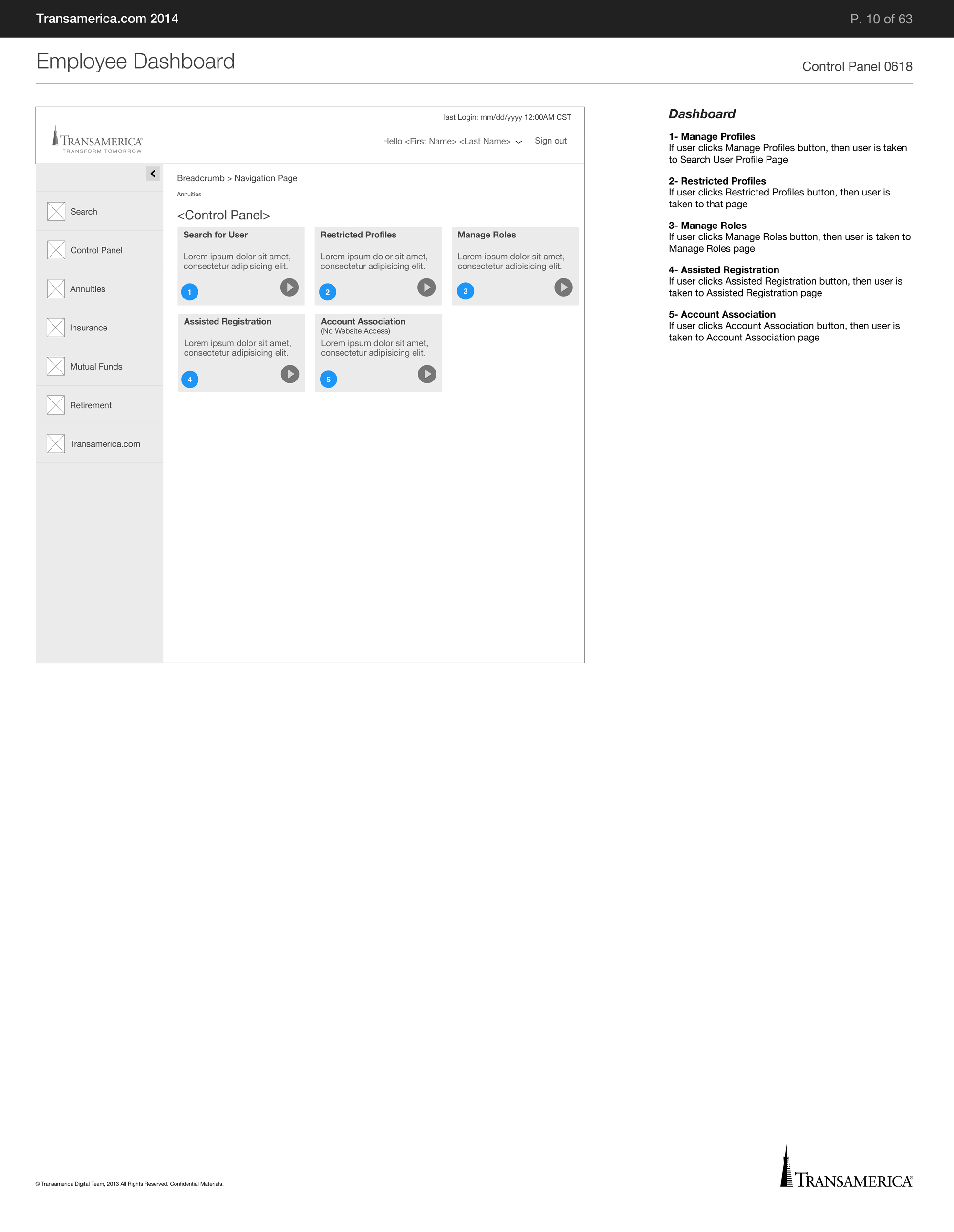
Worked closely with Business Analysts to create wireframes that are concise and developer focused.
Design
Visual Design
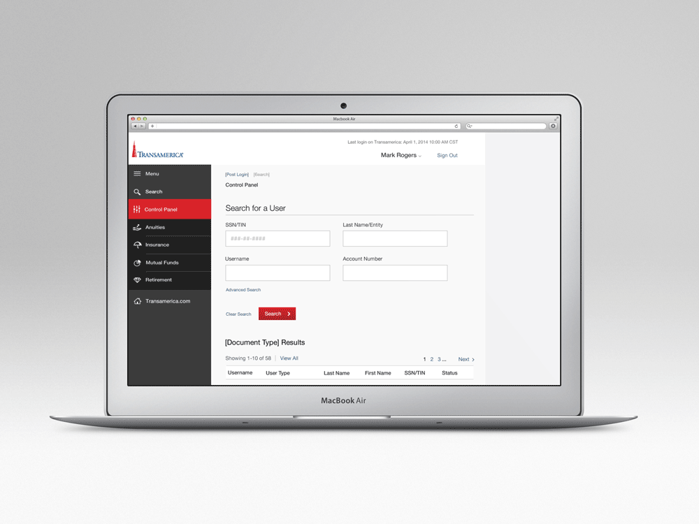
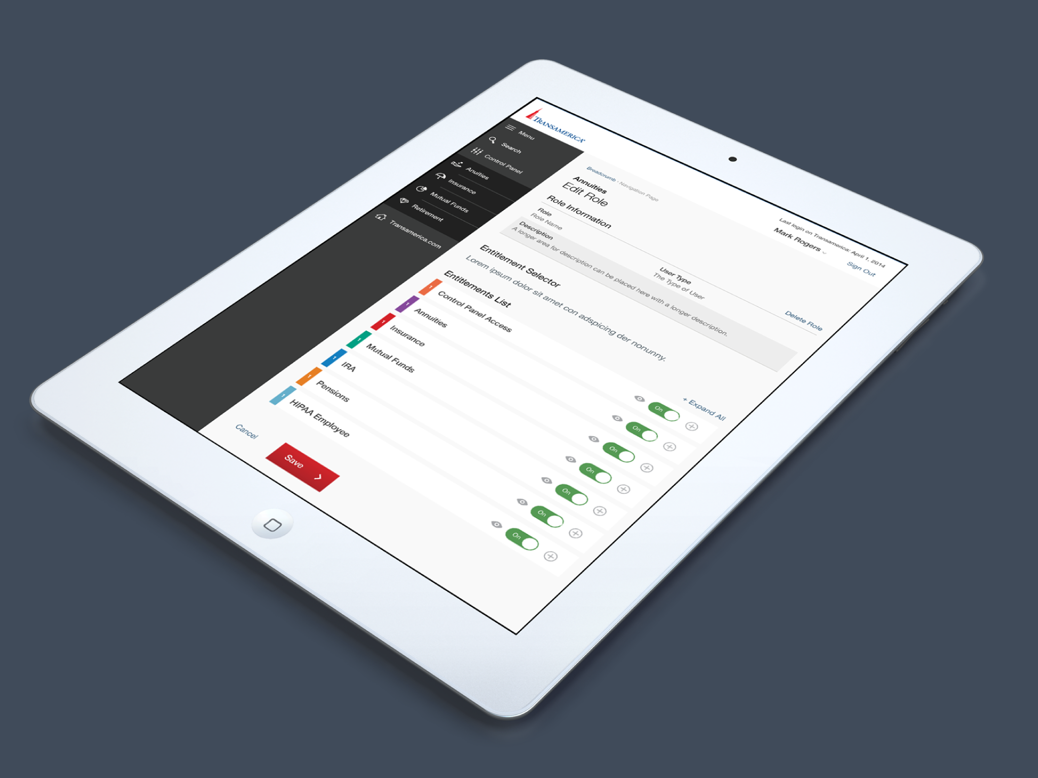
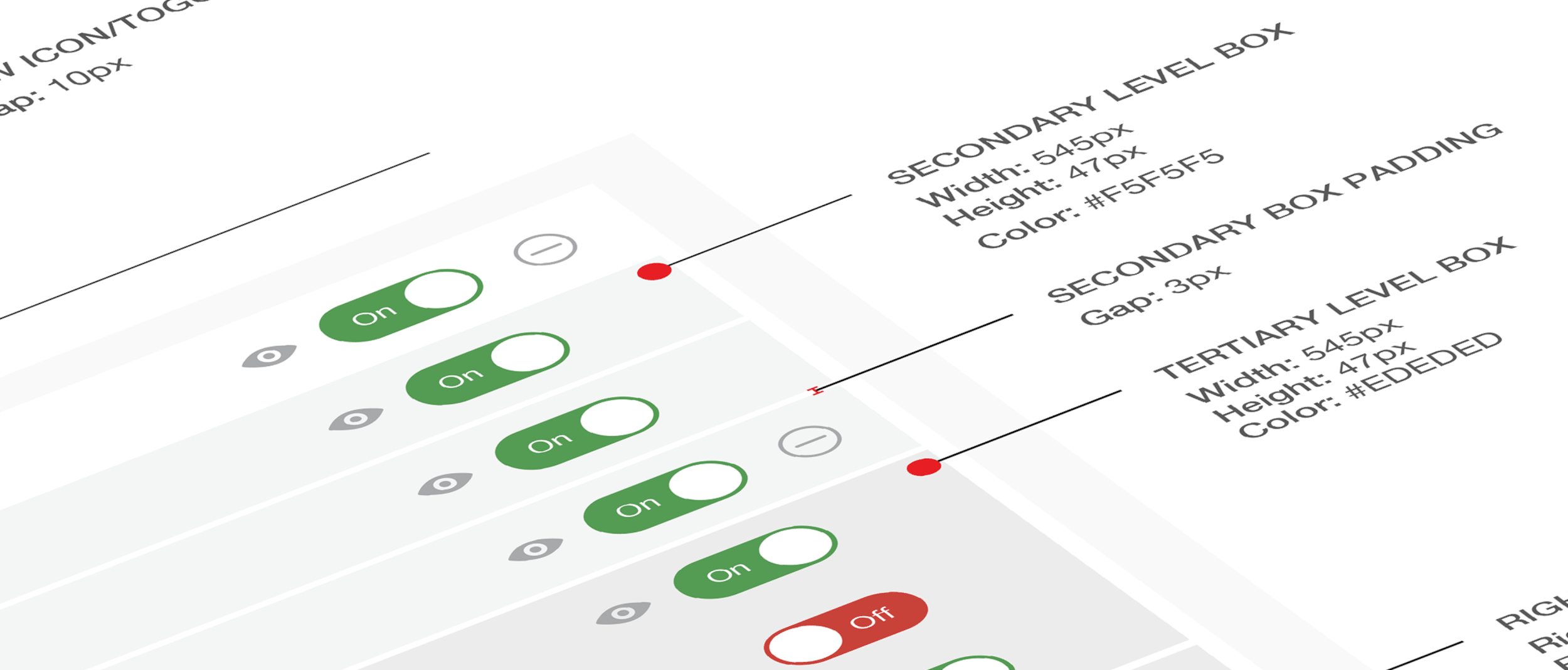
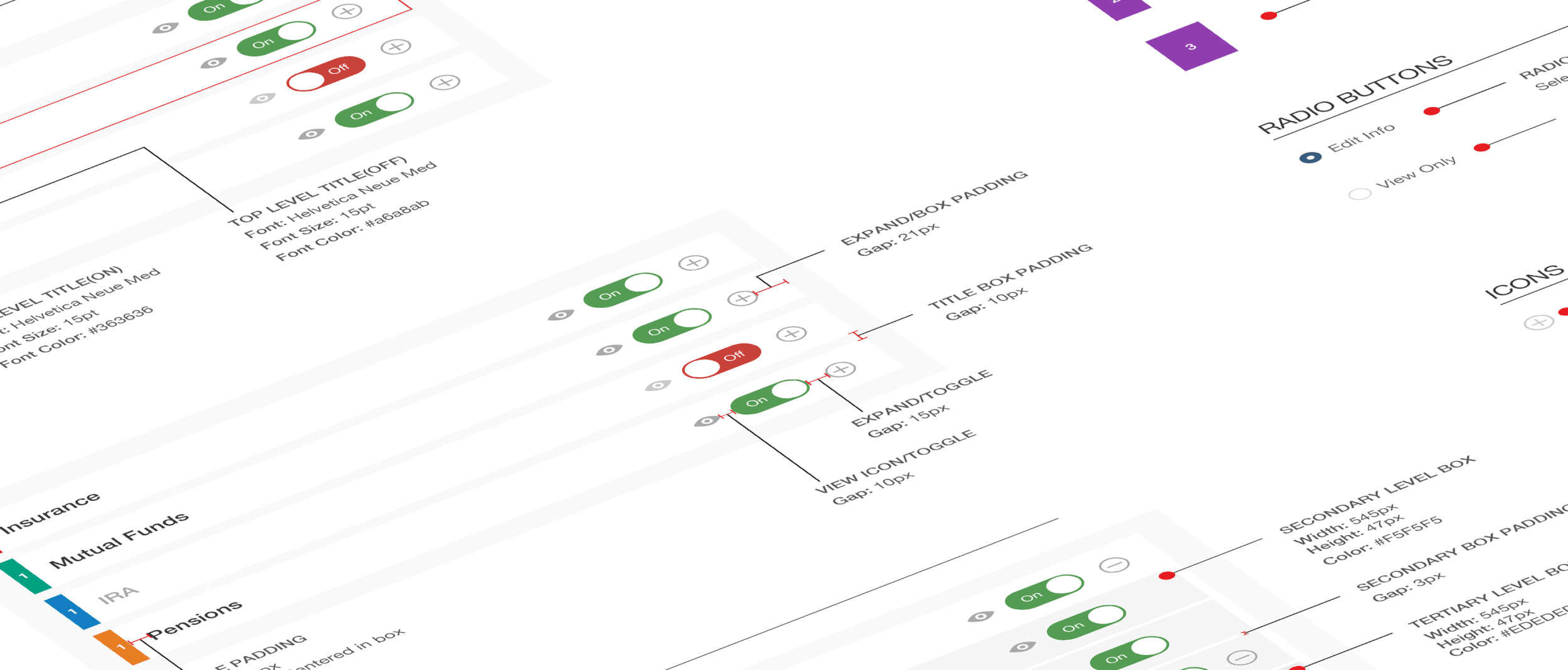
From the ground up, myself and the visual design team built a pattern library of components that would set the standard across all Transamerica products. We then moved onto build multivariate mock ups and once they were approved, we worked closely with Development to make sure the design asthetics were implemented.
Prototyping
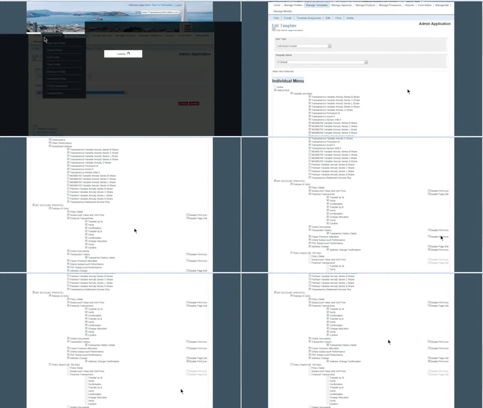
The two videos below show the legacy design interaction along with the new experience on the right. This is one example of how we utilized cross divisional collaboration and the ux process to address design problems and solutions.
Deliver
Solution
A complete overhaul of an existing system that is simple and intuitive for call representatives that is touch enabled and responsive to ipad.
