Life Tracker Project
Future Thinking
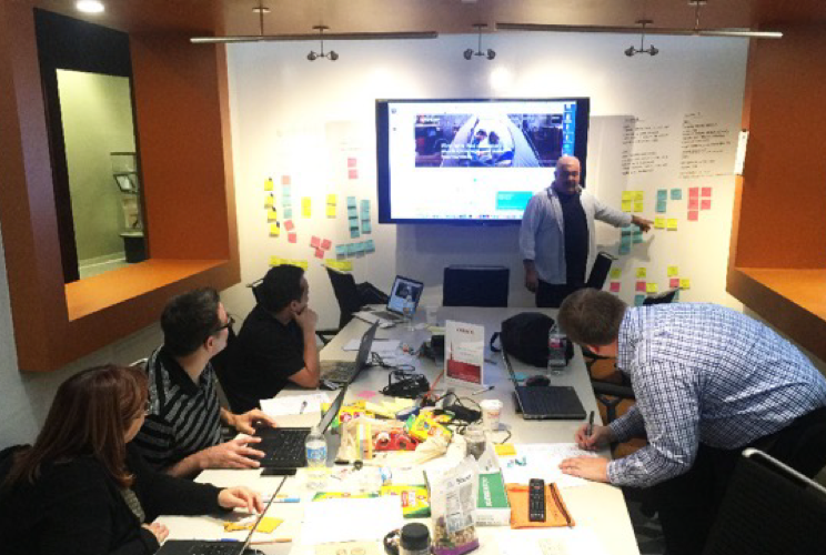
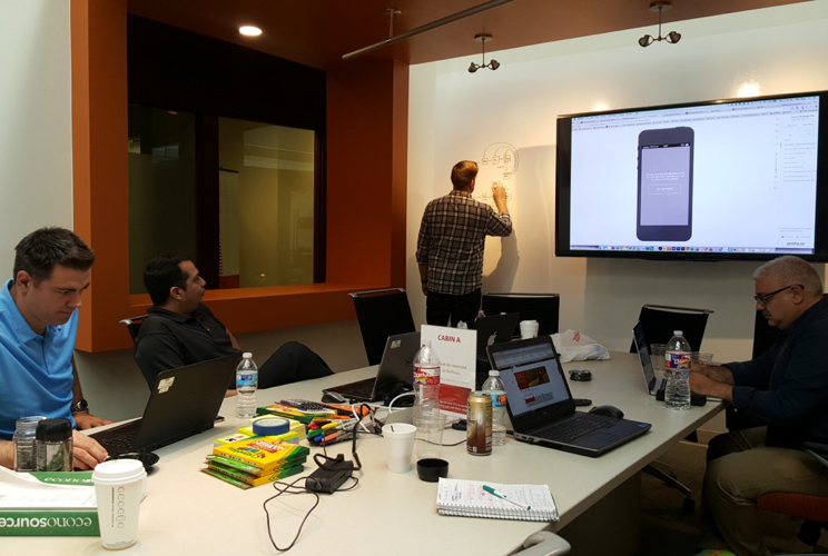
Transamerica leadership presented a challenge to the UX Design team to design the future of Transamerica’s product offerings and services. This was the perfect opportunity to run a slightly modified design sprint to generate new ideas for an app experience that would change the way our users would track their financial life
The vision
The Enterprise UX Team will build a native mobile application that will help consolidate new and existing 401k accounts. The app will educate, and provide relevant content, news and alerts based on the customers profile information. This companion app will support the customer by providing guidance throughout their life time.
My Role
Project Discovery | Stakeholder Interviews | User Research | White board/Ideation sessions | Rapid Prototyping | Usability Testing | Interaction Design | UI Design
Teams Involved
UX Lead | UX Researchers x2 | Tech Writer | Analytics Manager |
Tools & Technology
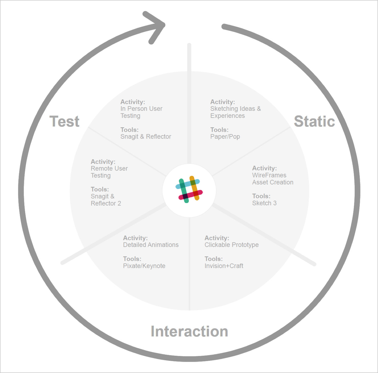
Slack | Mobile Sketch Template | Pop App | usertesting.com | Invision | Pixate | Sketch | Reflector App | Snagit Screen Recorder
Design Phases
CX Analysis
Stakeholder & Customer Interviews
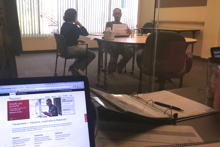
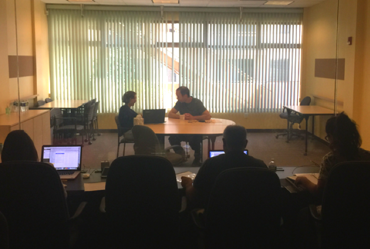
Lead research efforts and co-ordinated all stakeholder and customer interviews during the early phases of the project. We partnered with an external moderator to lead the sessions whilst we observed the participants to learn both how this will impact the company and current pain points that users run into.
What we learned
CX Team Visit
Our objectives
Slack Collaboration
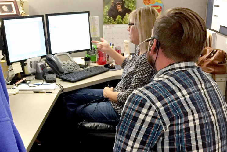
Myself, the UX team set up a slack group to work closerwits the customer care team and key stakeholders. This enabled us to share artifacts and knowledge with one another and to gather immediate feedback as shown in this image
Pain Points Identified
New Customers
Overwhelmed by product information | It takes too long to get a quote for coverage | They have way-finding issues | They don’t have a mobile experience | Content is very finance minded | They struggle to contact the right person | Digging the site for guidance
Existing Customers
They have issues with logging in to the right account | They have multiple logins for each product | They don’t have a simple snapshot of their product info | They have to login on Desktop to see information | They want advice and updates for their products
Rethinking the Entire UX for IOS/Android
High Level Features
With a focus on Insurance, Mutual Funds and 401k Products, we identified that the following features were most important to our customers:
Login to your account (New and existing customers) | Learn about Transamerica Products | Get guidance on what to do at your stage in life | Roll all your existing accounts into one | Contact the company | Read TA Blog. (News and updates)
Capitalize on Native Capabilities
Sensing Ambient Data
Location | Could be used to help get a quote or find an agent in your area
Sound | Notifications and alerts for products you have
Time of day | Let’s you know when agents are available to talk
Camera | Could be used to take a photo for your profile
Camera | Take photo of credit card for product purchasing
Movement | Track your health data which could be used to speed up insurance purchases
Connecting Devices and Objects
Cross Platform | Users can seamlessly check their information at anytime on any platform
Tv’s/Mirroring | Watch the latest news and videos on Insurance
Smart Objects | Let’s you know when agents are available to talk
Other Apps | Connect with health applications like Human to track data and update your profile information
Wearables | Connect with Apple Watch for an even more simplified snapshot of your account?
Contextual Awareness
Geofencing | Could be used to help find an agent in your area and get a quote. Or locate the closest doctor for your health examination to set up an appointment
Beacons | Could be used to trigger the nurse to let them know you are here for you Part 2 examination
IA For Native Application
Worked with the UX design team to understand our customers pain points. From here we were able to prioritize and consolidate their needs into a simple architecture.
• 3 primary modules with multiple views for each.
Reflection
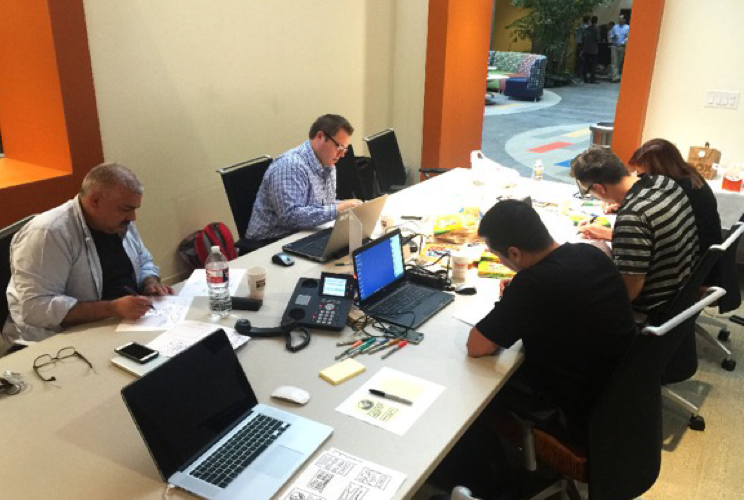
I lead a 2 day workshop with Stakeholders, designers and developers for the Life Tracker App which included journey mapping, persona exercises and sketching ideas to envision new experiences
Identification of Customer Touchpoints
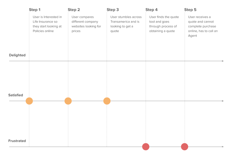
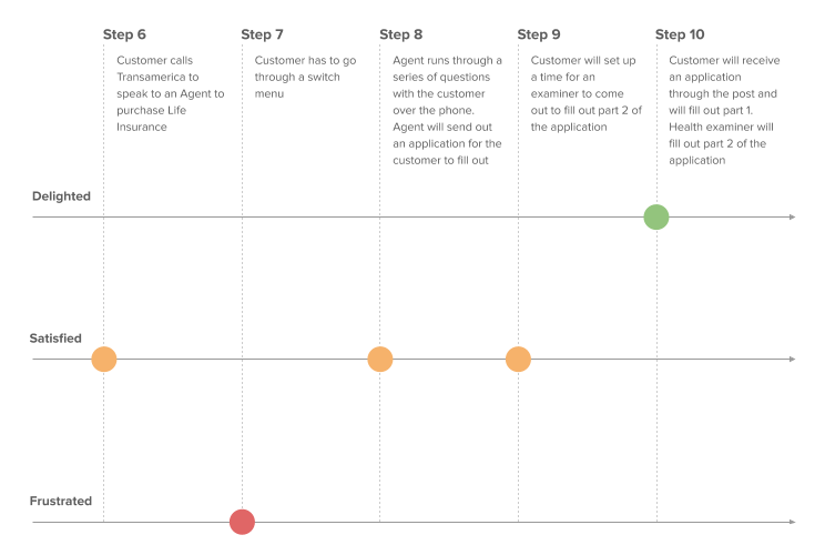
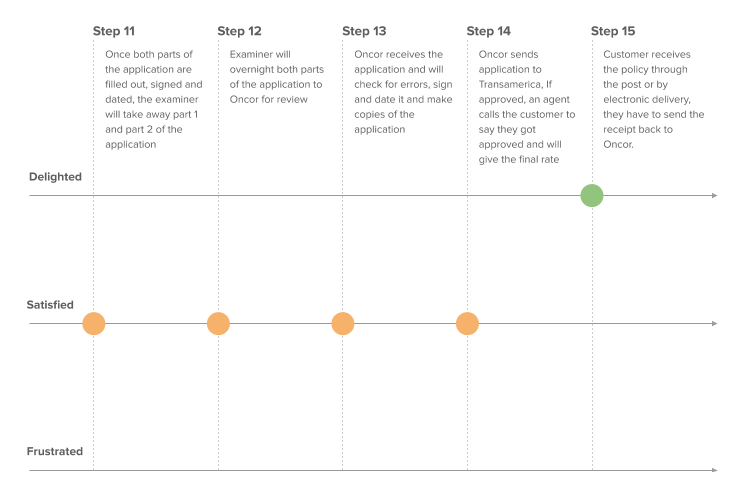
After the 2 day workshop, on of the action items was to follow up with several users and run a experience mapping workshop where we identified all the steps involved in getting a life insurance policy. As you can see below, there are 15 steps a potential customer has to take. We were able to identify all the major pain points in that journey that helped us shape the experience going forward. We were ready to start ideating.
Ideation & Prototyping
My Workflow
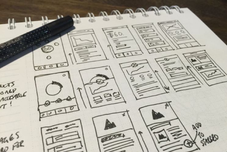
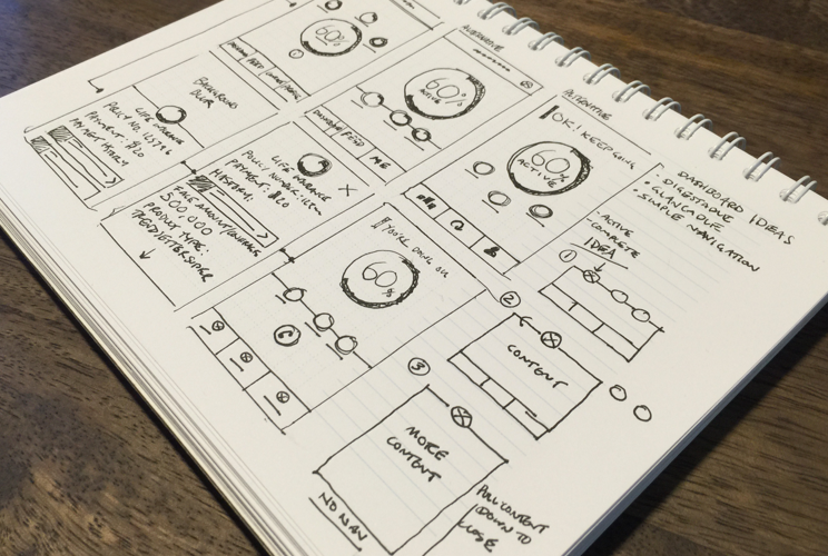
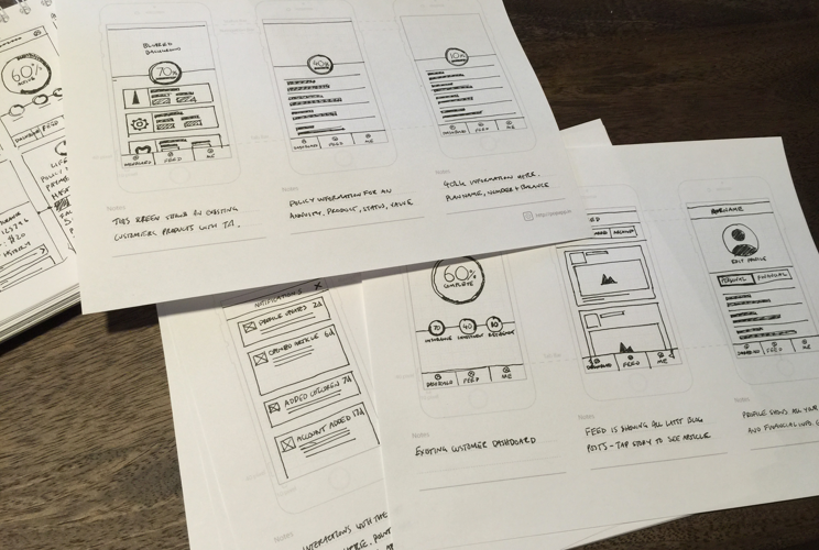
This is my prototyping workflow for exploring interaction design solutions — from sketching on paper and pop app templates, to creating high fidelity screens, adding transitions and animations, and testing the prototype on the device with target users.
Rapid Ideation
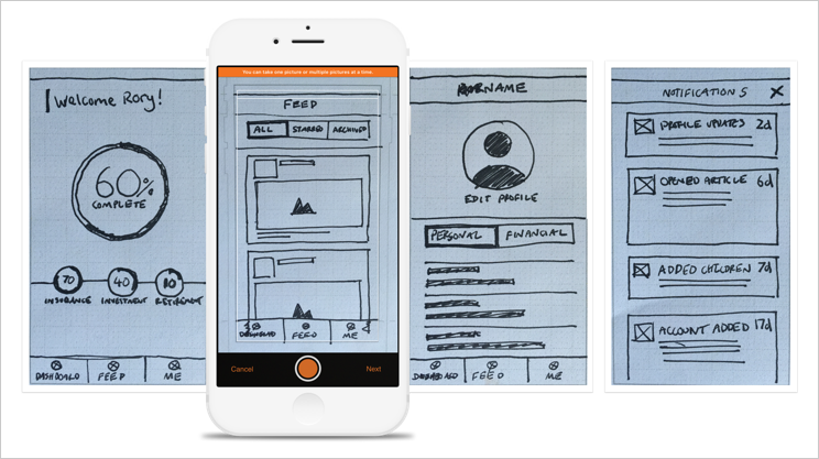
First, I created quick thumbnail sketches of screens and potential screen flows based on all the insights we received during the early phases of the sprint. After getting some general feedback on the flows at a high level I moved onto creating more detailed screens which would then be translated to POP App using the downloadable template on their website.
Paper Prototyping
I added images to POP APP and added clickable hotspots to bring the experience to life to get more detailed feedback on the experience. Although these screens were extremely lo-fi, the feedback I received helped shape the direction for the wireframes. Users appreciated the simplicity of the categories and the information presented to them, it felt much more personal compared to other financial apps in the same space.
Lo-Fi Wireframes
After synthesizing the feedback from the paper prototypes, it was time to take the fidelity somewhat higher to get a real sense of how this app would look and feel in the real world. We worked with a copy writer and marketing manager to legitimize the copy in Sketch and moved the wires to Invision. The next step was to partner with researchers to set up moderated and un-moderated usability studies.
Moderated/Un-Moderated Usability Testing
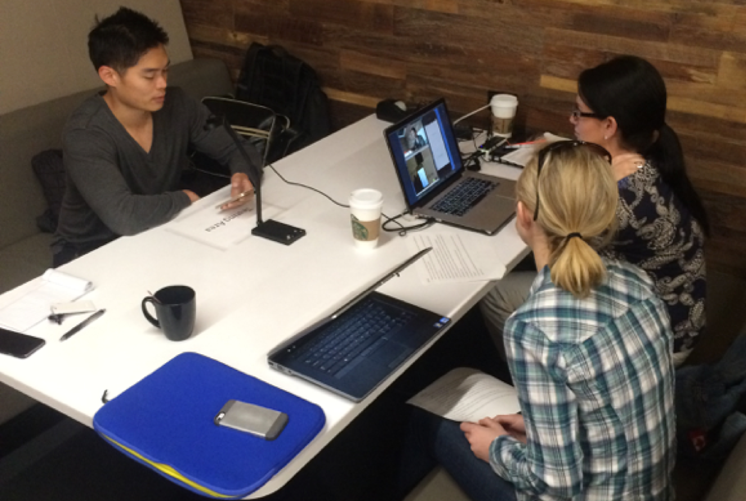
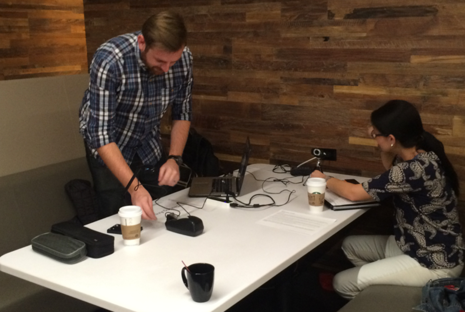
I worked closely with the UX researchers to facilitate Guerrilla Testing next to Starbucks to get immediate feedback on the app. We spent the best part of a few hours approaching people to see if they would provide some quick feedback for us. We quickly set up the usability lab on one of the desks and the level of engagement was astounding. Some of the feedback we received was in line with the original goal of giving the users the ability to manage their accounts and get quotes quickly and efficiently. The 2 week sprint was working.
Implementation
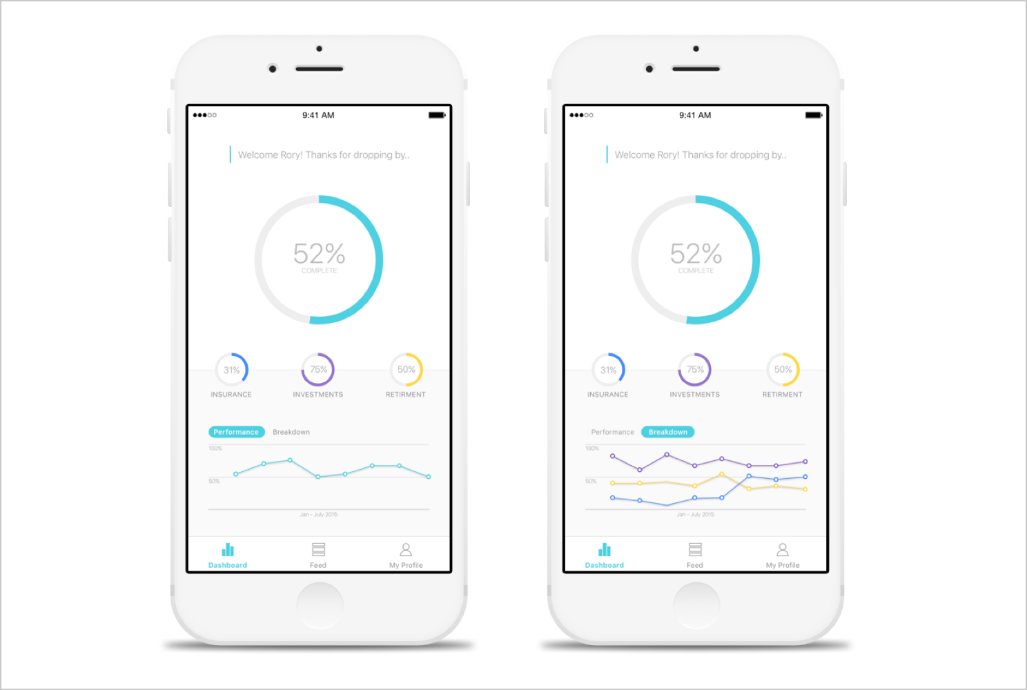
After several usability studies, I was able to quickly iterate on our designs and make valuable tweaks. This lead to some of the screens you see below that were presented to leadership about what the future of Transamerica could be.


