BigRing Insurance
A HUGE OPPORTUNITY
In 2013, we were giving the opportunity to build a fully responsive bike insurance website. The first of it's kind for Transamerica. We had just 2 weeks for discovery, definition and design. Here's a look at what we did.
Our Vision
The Transamerica Digital Team will create a best in class Bike Insurance website that will be usable, valuable, and desirable to our target audience by aligning user needs with business goals and providing UX artifacts and creative assets that will streamline development.
The Stakeholders Expectation
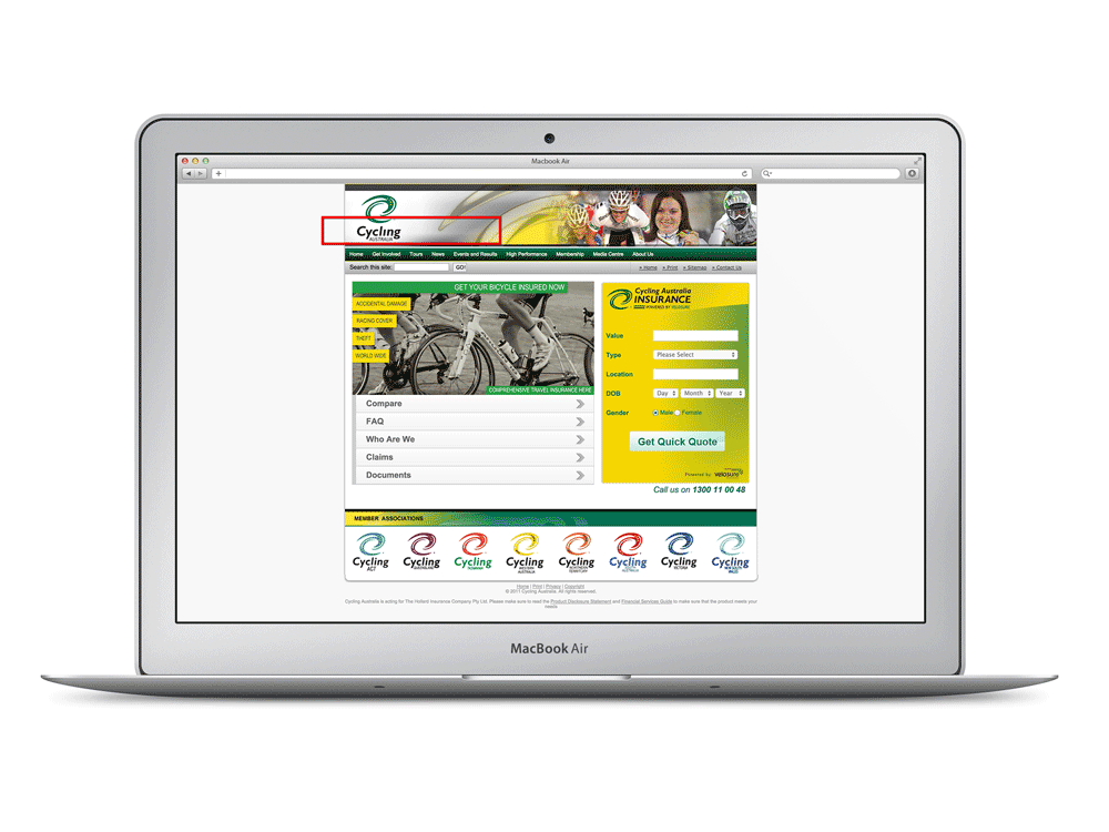
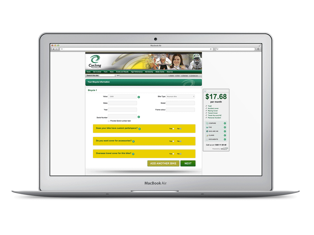
Below is an example of what the stakeholders were envisioning the final product to be. One of the great things about this site was the fact that it was very quick to obtain a quote and key information was upfront. However it wasn't responsive down to mobile devices and we believed if we created a responsive site it would not only increase conversions and create a cohesive experience, but it would be the first responsive website for Transamerica.
Planning: Deliverables
The Business
Requirements | Compliance | Governance | Timelines | Use cases
UX
Competitive Analysis | Personas | IA | Wireframes | UI/Visual Design
Content
Strategy | SEO | Analytics | IA
Creative
Brand Strategy | Style guides
Development
Architecture | Front end | Responsive | Logic Tier | Data Tier
QA/UAT
Test cases | Alpha release | Beta release | UAT | Final release
Timeline
We knew we were going to be extremely agile due to the amount of time we had for UX and creative, but the high level timeline below really helped the team understand key dates and deliverables.
Start Friday 9/27 | End Date: Tuesday 12/31 | Weeks 14 | Days to complete 68
Discovery
Competitive Analysis
We looked at our competitors to see what products and services were offered, strengths and weaknesses and differentiators. We also created a feature list against our competitors.
Cyclist Personas - Understanding our users
We wanted to create reliable and realistic representations of our key audiences. In order to do this we put out a number of surveys on cyclist forums and some social media platforms to get as much insight about the needs of the different types of rider.
Casual
Likely to ride when the weather is niceNon-competitive
Likely to use cycling as a regular form of exerciseCompetitive
Likely to compete, but cycling is not their professionProfessional
Professional or working to become professional racers
Definition
Worked closely with SEO and development teams to build the architecture of the site and to implement keyword optimization. The image on the right is an example of how we matched the business goals with the needs of the user.
Design
Process Flow Analysis
Simplification of a complex process flow. The user experience for getting a quote can be broken into two distinct processes: Get A Quote and the Enrollment. In order to increase the likelihood of a user scrolling, we'll chained them together in a logical and intuitive manner
Wireframes
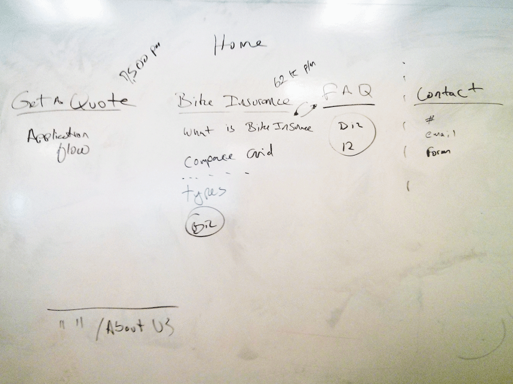
Bridging the gap between business and development. Initially we took to the whiteboard to come up with 3 solutions for the home page. We took into account all the possible viewports and how the structure of content would collapse. From here we then chose one of the concepts to move forward based on quick user testing techniques.
Choosing One Solution
Based on user feedback, we were able to move forward with one of the concepts and from here we could create fully vetted wireframes with clear annotations and interaction flows. In conjunction with that, we created design comps that covered all visual and UI aspects of the wireframes. We worked with development to incorporate the visual design and once we had a working high fidelity prototype we were ready to start user testing.
Testing
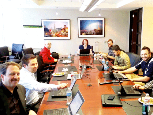
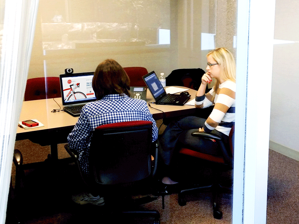
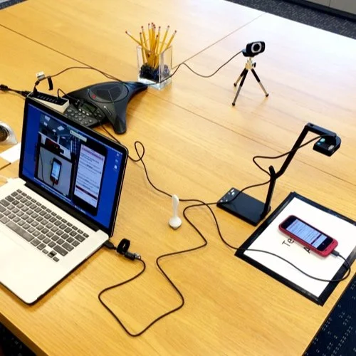
The following images were taken during usability testing for both desktop and mobile.
What we delivered
A beautiful and predictable responsive website that is extremely performant on any device due to progressive enhancement techniques.


