Onboarding
REDUCING FRICTION
Oversaw the user experience and design direction for a more streamlined onboarding experience across TV, Mobile and Web devices
What We Delivered
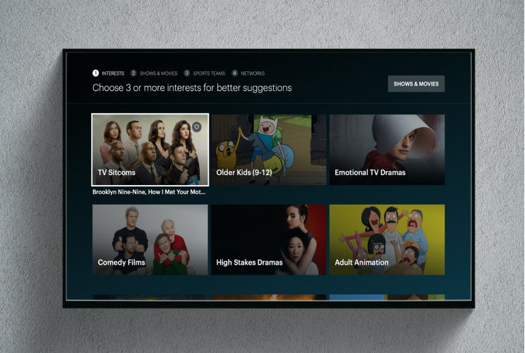
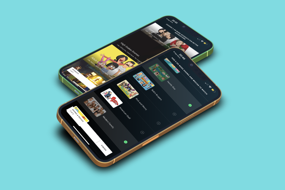
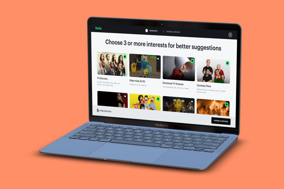
A streamlined onboarding experience influenced by data, best practices and user feedback. We delivered several iterations with the same underlining UX but a UI best suited to the platform with a focus on accessibility.
Background
I was given the opportunity to oversee the redesign the existing Hulu onboarding flow across our devices. Data showed that there was a significant number of users skipping through the screens in different parts of the experience depending on which device you were on. So we were tasked with role of better understand why this was happening.
The Core Team
Product Owner
Design Manager (Me)
6 x Designers (2x Web, 2x Mobile 2x Living Room)
1x UX Researcher
1x TPM
3 Engineering leads supporting Web, and Mobile & living room.
The Challenge
To simultaneously ship a more streamlined onboarding experience across multiple devices and have the designs ready for execution within 1 month. We also learned that whatever we delivered here would need to be scalable for our one-off events such as March Madness and the Olympics. No Pressure!
What We Inherited
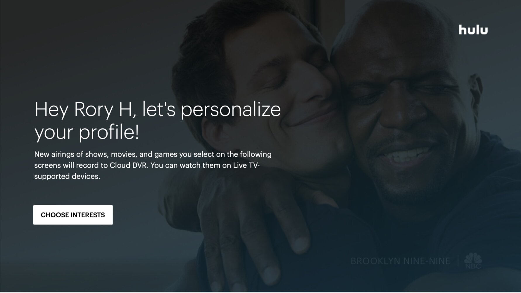
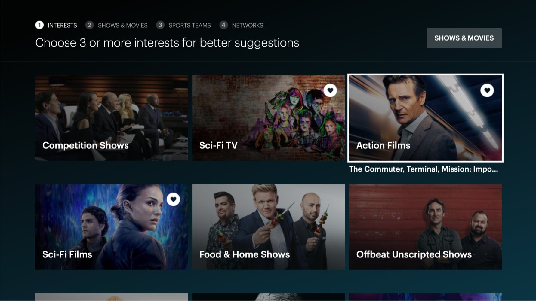
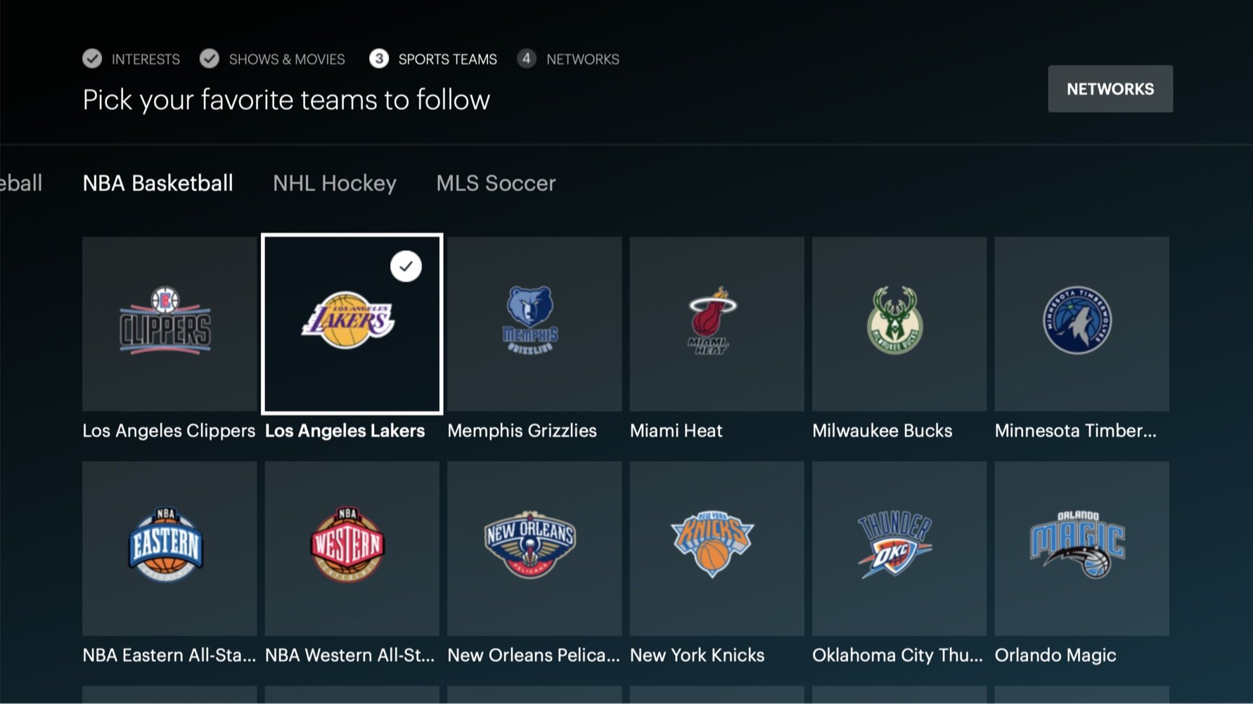
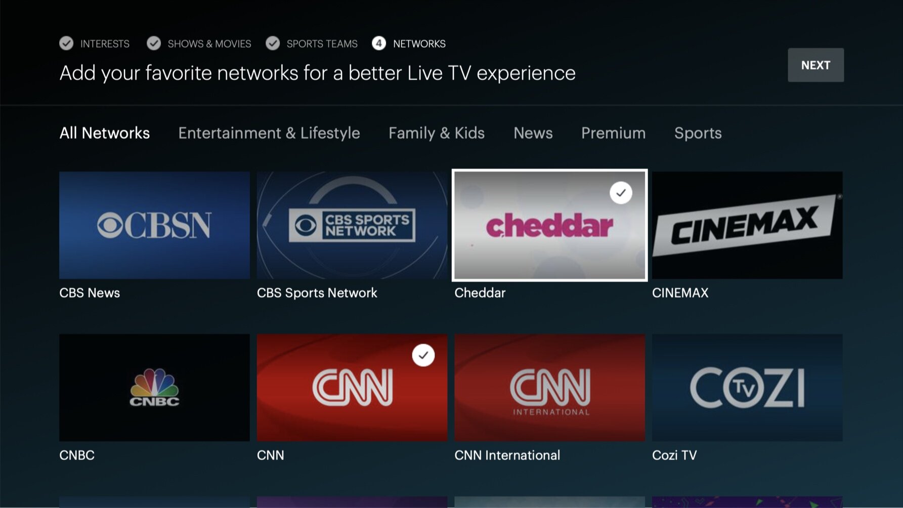
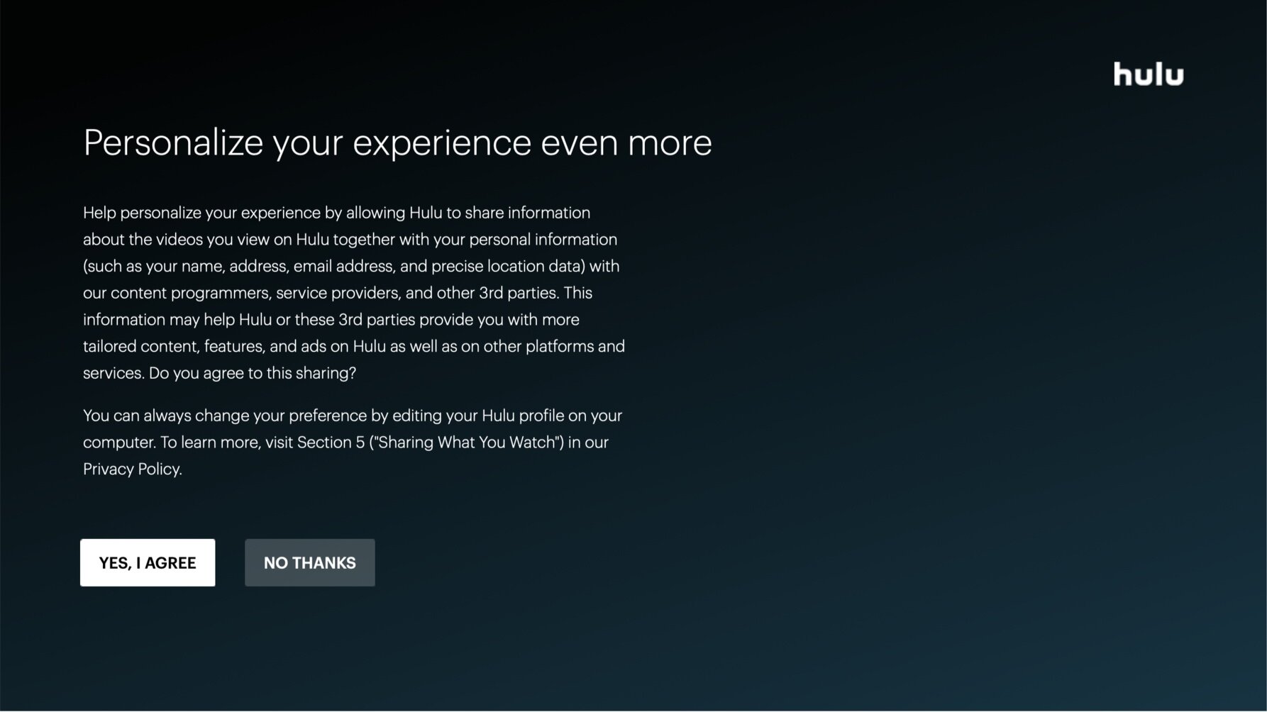
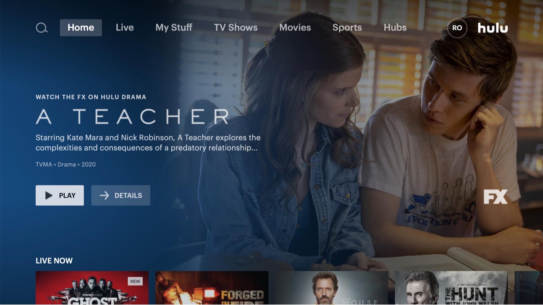
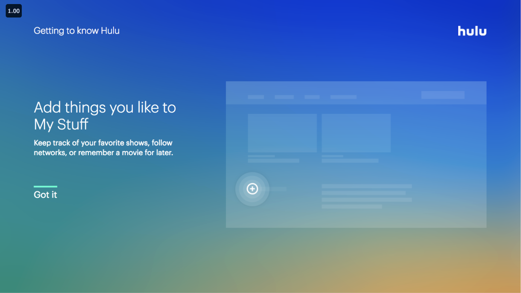
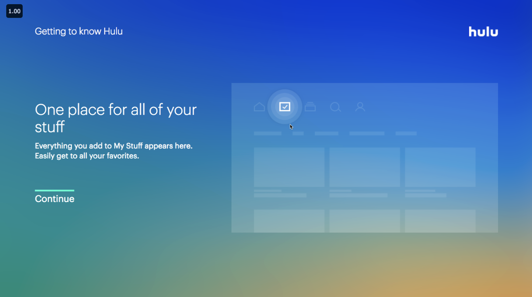
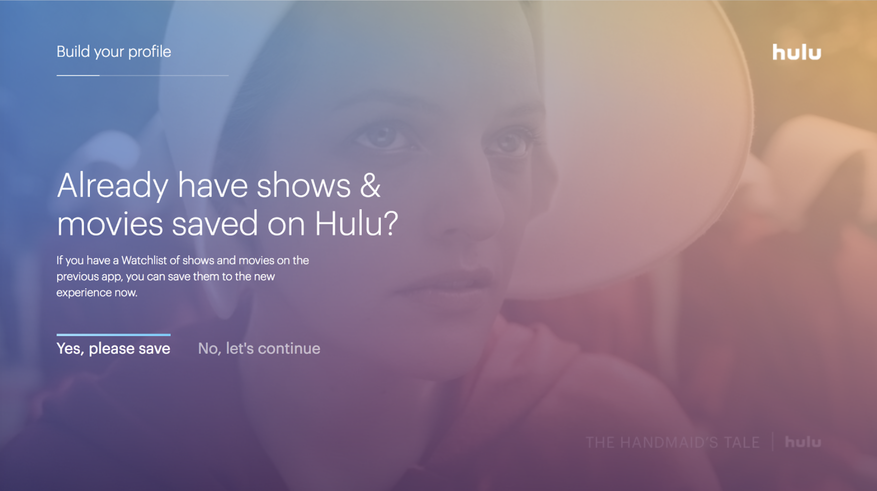
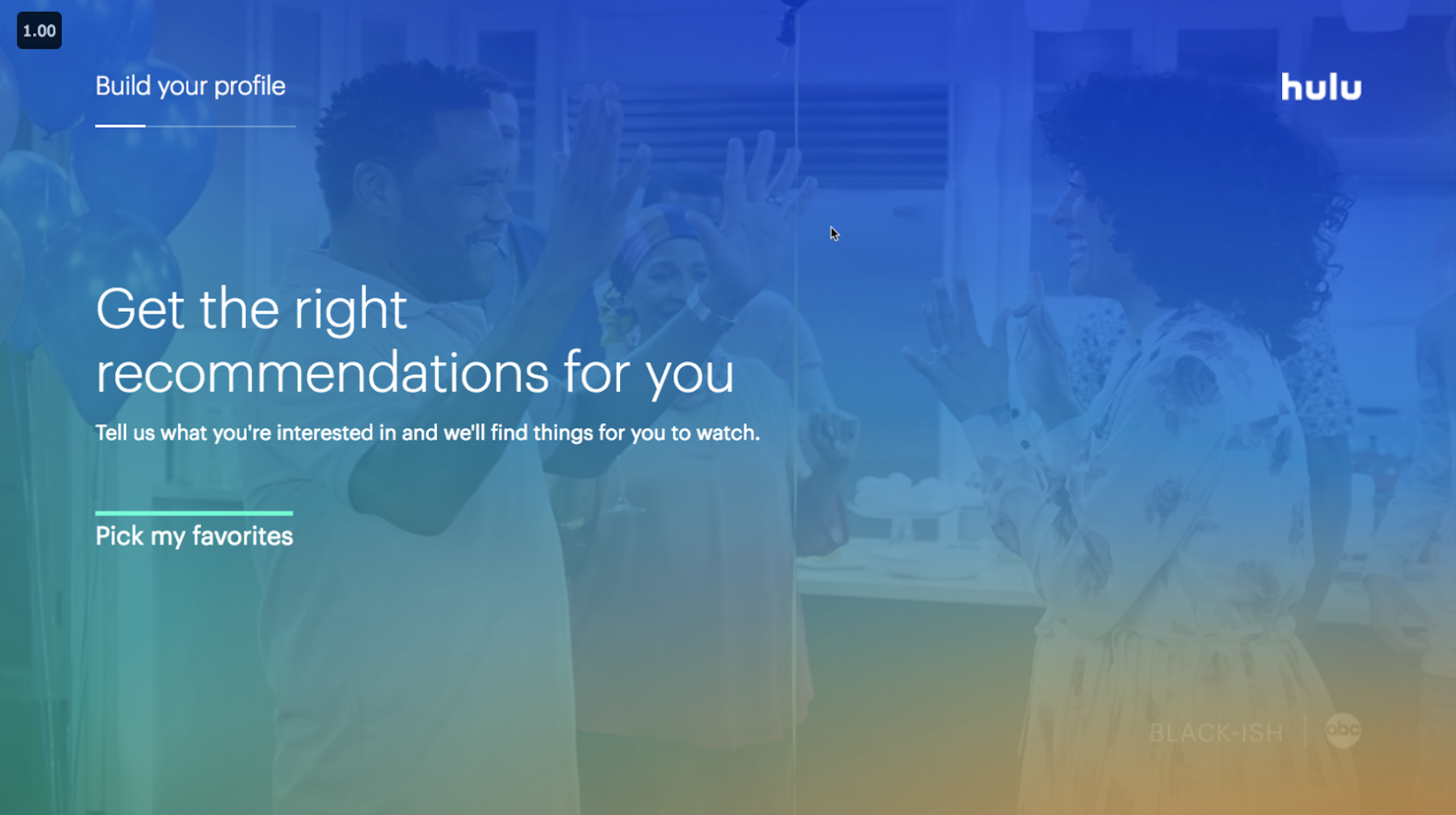
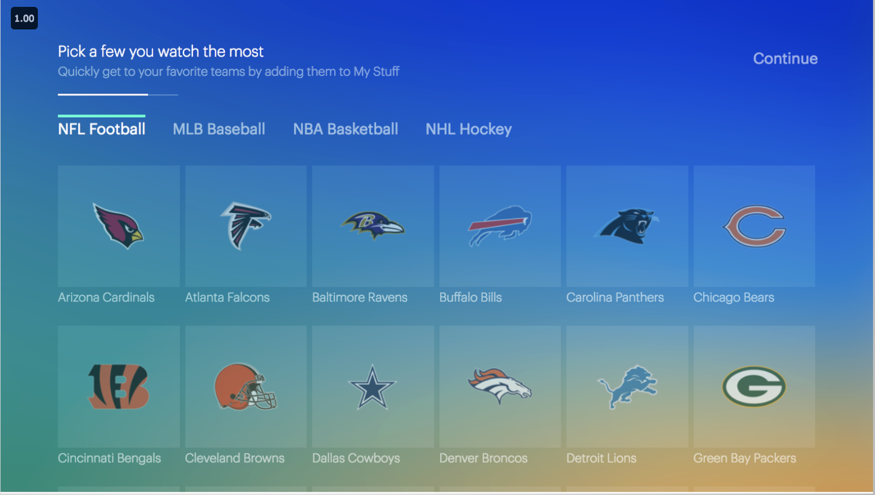
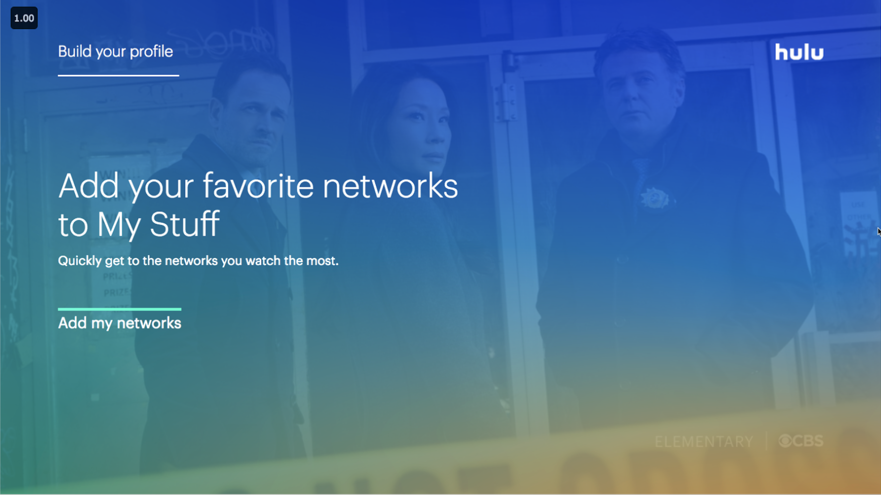
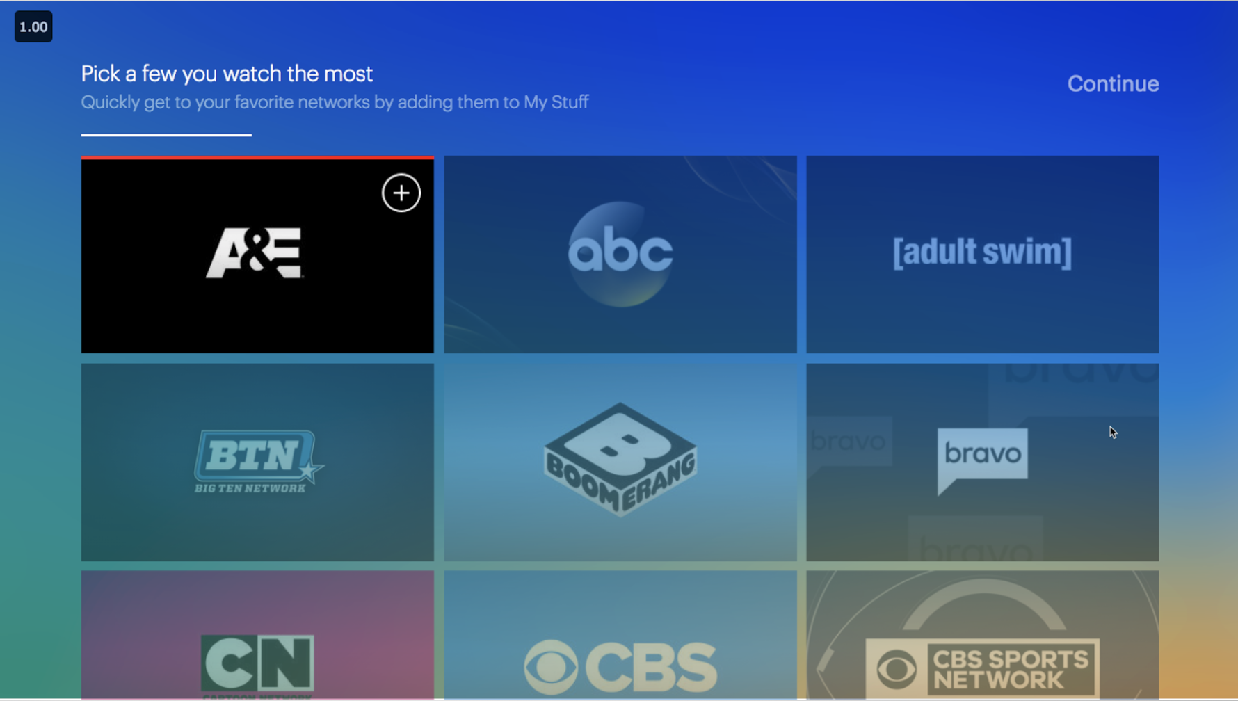
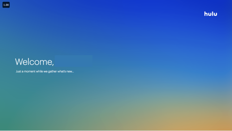
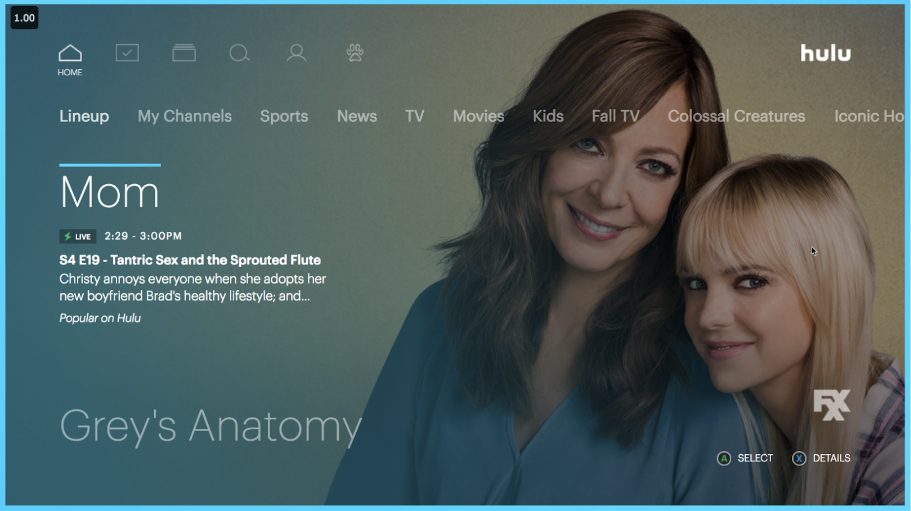
TV Experience Example Screens
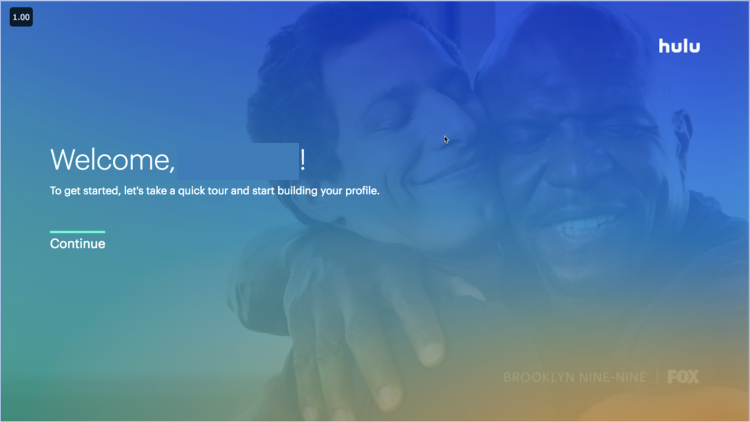
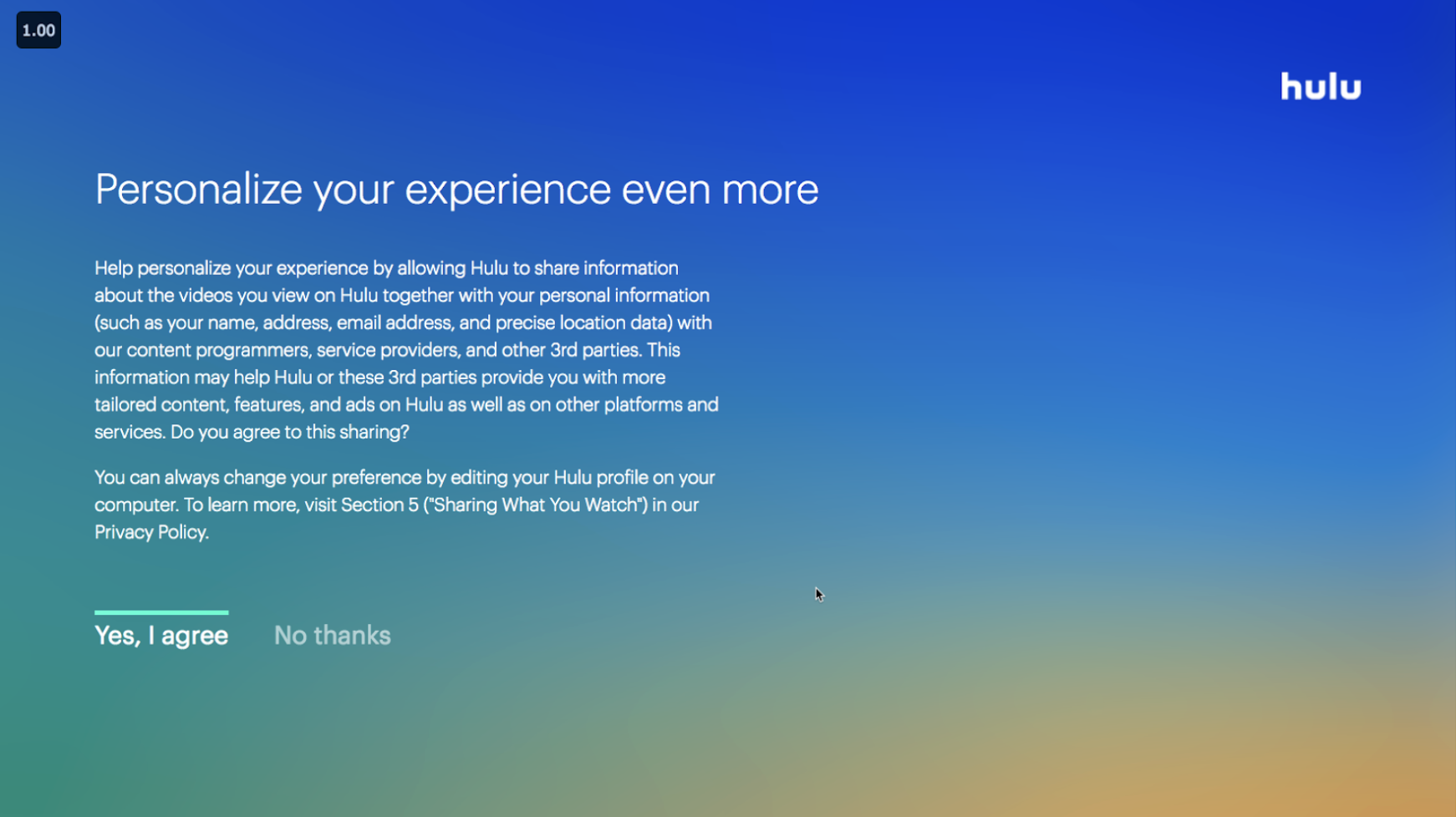
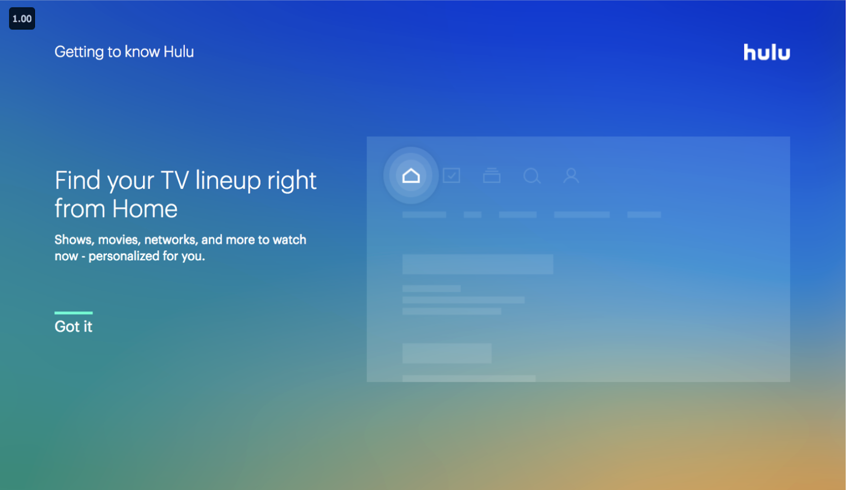
The whole concept behind the onboarding experience was to have users pick a few genres, shows and movies they were interested in to help kick start the algorithm into creating a more personalized experience. However, due to the number of screens, initial research showed that fatigue set in after the first few instructional UI screens (As you can see in the images below).
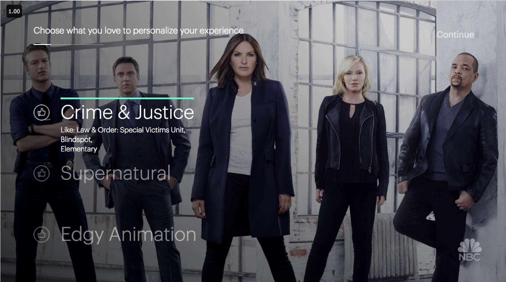
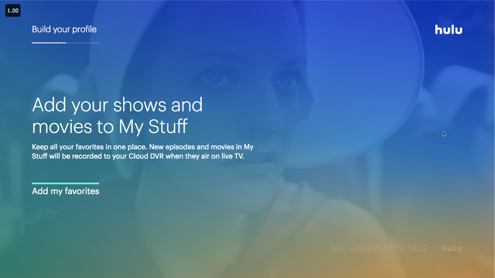
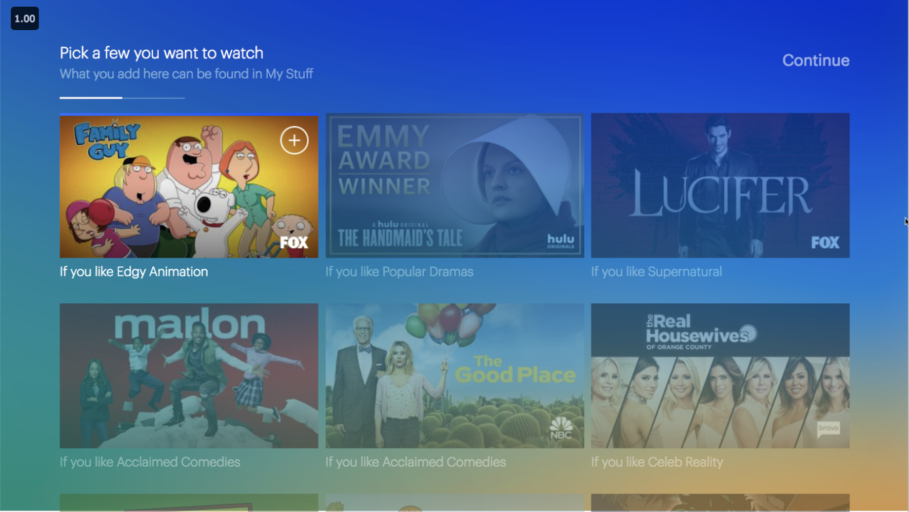
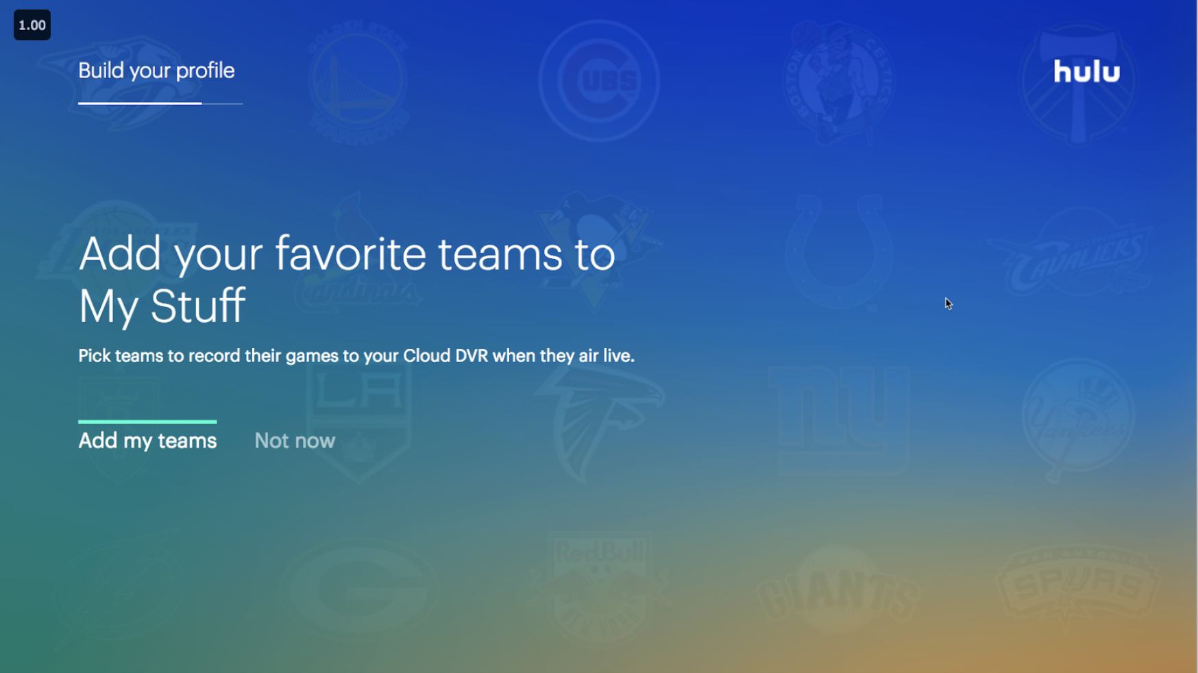
Ideation & UserTesting
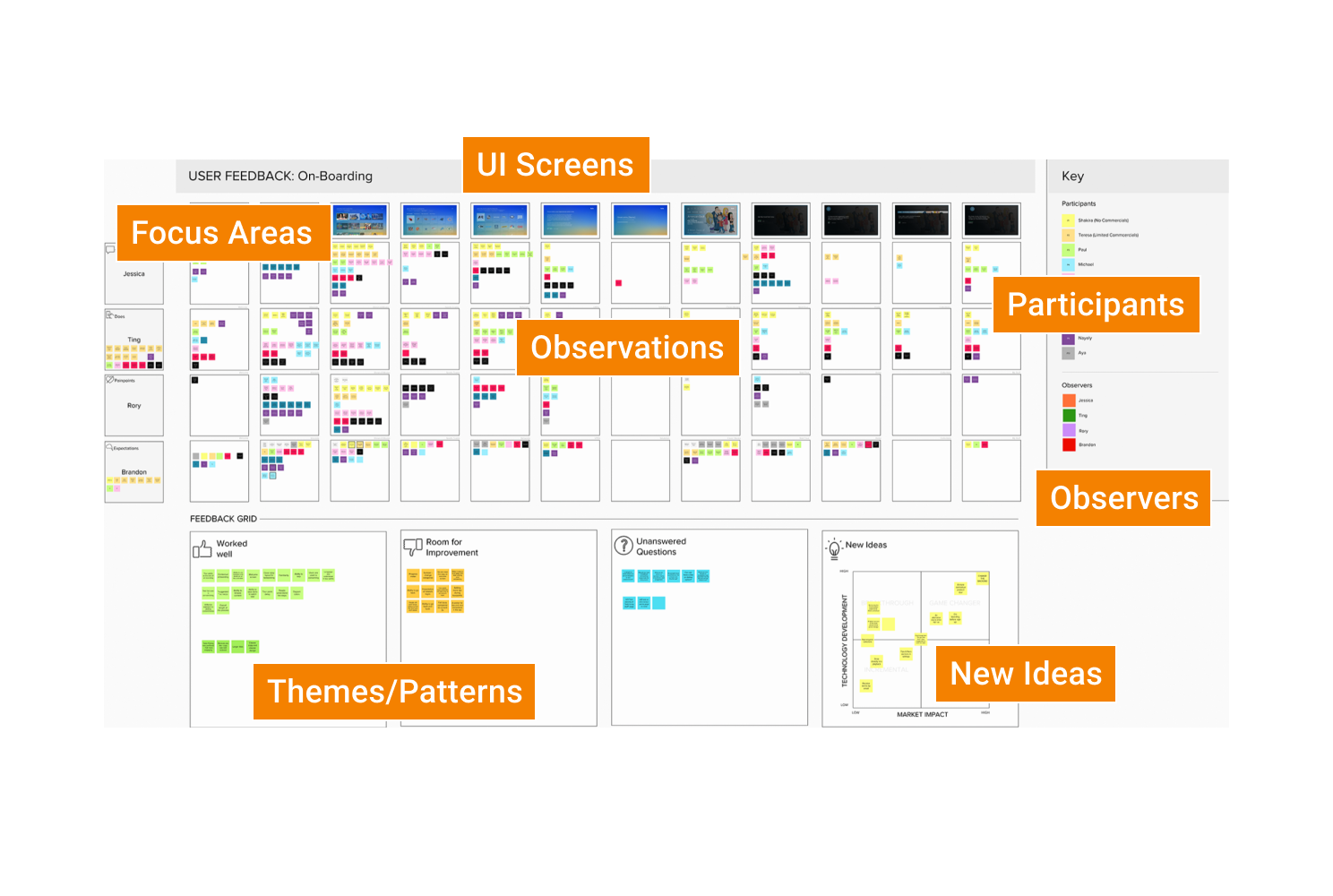
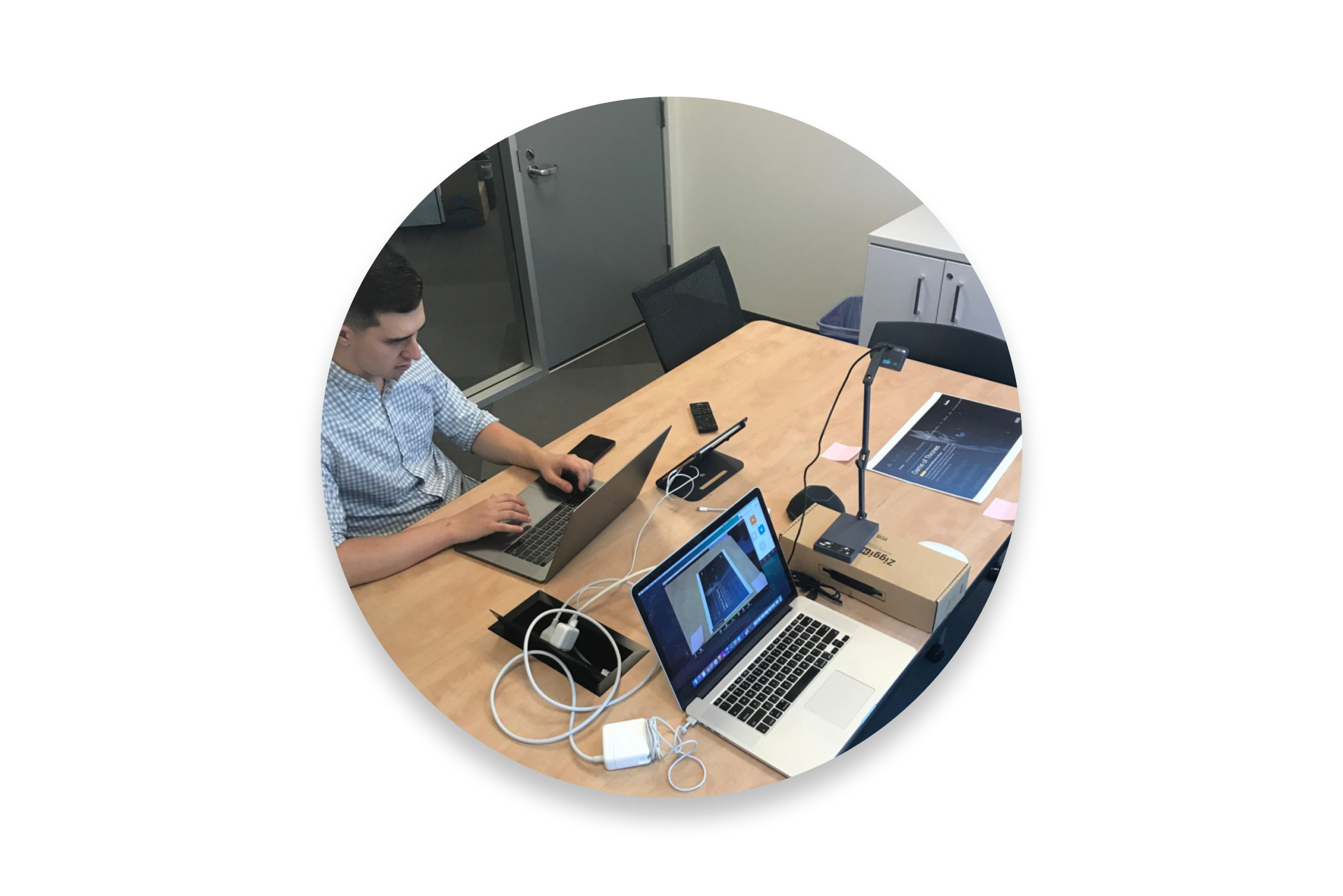
The images above show just some examples of how we tested the existing onboarding experience. I created MURAL testing template that outlined each screen with the ability to and notes. As we tested external participants, we would write down specific feedback in the MURAL in realtime and collectively discuss the feedback after each session. Other testing exercises included low budget quick feedback sessions with internal employees across the company. These exercises proved to be hugely successful in helping us make informed decisions based on the correlation between what we were seeing in the data and what people were saying.
First Release
The image above shows what we initially delivered and launched across devices. The visuals below show the updated UX and UI on TV’s that we iteratively released over the following weeks. We continued to focus on improving the content to remove unnecessary information and make sure the UI was accessible throughout.
A Scalable Solution
Based on the new experience we had delivered and components we had build, we were able to quickly deliver an entirely new UX for special events for the live service. This included March Madness and the olympics which had huge impact on engagement for the business throughout the year.


