Collaborative Observation Techniques
LEARN FAST, DECIDE FASTER
A New Way of Capturing Data During Moderated/Unmoderated Usability Studies
It all began in 2017..
How myself, a designer, a product manager and a small team of researchers used alternative observation techniques to help drive key DVR/Recording decisions quickly after usability testing.
What we learned here became a standard process for my team when testing their designs leveraging tools like usertesting.com. Here are some other examples of how this evolving approach has been beneficial to the team:
Able to address problems and iterate in days, not weeks
Stakeholders can see feedback happening in realtime for each participant
Stronger partnerships between Design, Product, Development and UX Research
Living, scannable documentation that can always be revisited anytime, anywhere
Process can be done entirely remote
The Initial Challenge
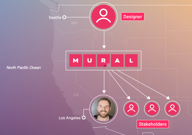
Time was not on our side and we needed to inform the product manager of the best approach to help make a decision within a few weeks. The majority of usability testing was going to be located in Seattle as that’s where the research team was located at the time. The week for testing was scheduled at a time that wouldn’t allow me to travel so how was I to be kept informed and up to date of the learnings? Was this possible to do in real time so I was able to see which participant was being interviewed?
Investigation
We were interested in the opinions of DVR users who have established assumptions for how content is saved to and managed within their DVR so it was decided that given the timeframe, we would send out 2 surveys;
Surveys were emailed to respondents containing 17-18 questions related to recording habits
50 responses for survey 1 and 55 responses for survey 2
The feedback received was extremely useful and aligned with the use cases we were designing for.
Understanding
Initial Ideation
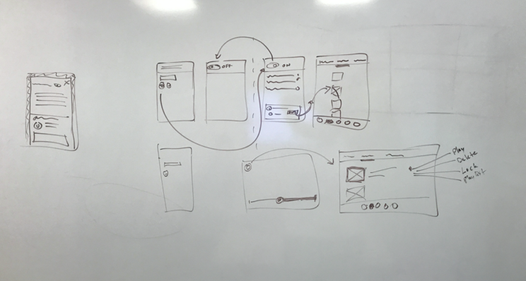
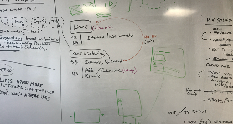
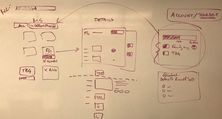
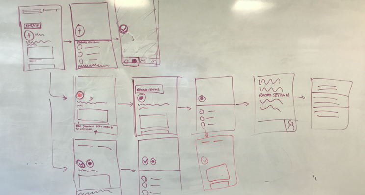
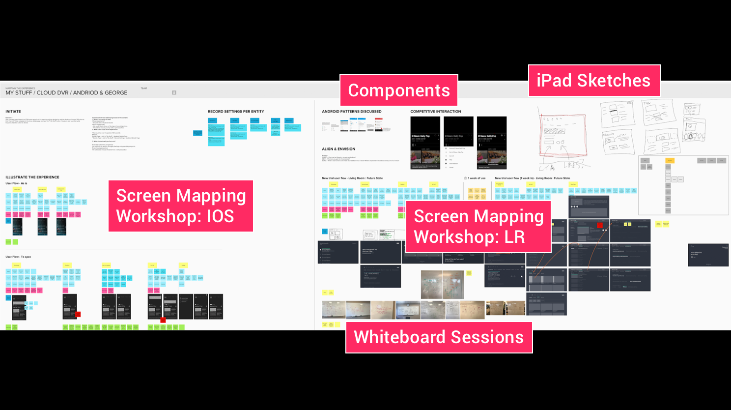
The iterative steps we took here were relatively straight forward. As feedback was coming in from the surveys, myself and the designer took to the whiteboard to jam on some ideas around record settings which included system logic, user flows and how they would solve the specific user stories.
Workshops (MURAL) & Prototypes (Invision)
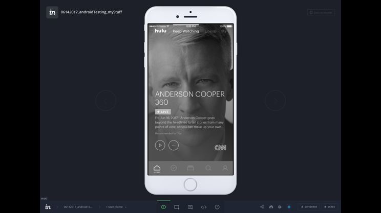
After several sketching sessions with the designer and product manager, we then put together some lo-fi UI screens together in In-vision to run some small mapping workshops in MURAL with the researchers on the project. Once we addressed all the potential issues with the experience we put together 2 simple click through medium fidelity prototypes focusing on the messaging to test on userzoom. We also worked closely with UX Research team to build the script scenarios around the goals we had set
Room for Improvement
Going back to what I mentioned earlier, the challenge was not only the given time we had to try and solve the problem, it was the fact that I was not going to be a able to make the testing sessions as they were in happening in Seattle and I was in LA, unable to leave at that time.
There were a couple of things I started to think about;
What are some ways in which I can stay or feel involved in the sessions even though I’m unable to join,
How might we take observation notes collectively on one document and use those notes to look for themes and patterns and to prioritize
How might we, as a team, make informed decisions within days as opposed to weeks (Waiting for research readouts)
Note Taking
I started to think about how observations were typically documented in silos. I’d see designers and researchers taking notes in their own preferred documents; excel sheets, stickies, google docs, basically what ever tool everyone was most comfortable in using. That’s great from an individual stand point but from an operational and collaborative approach, not so much. There is an entire process after the study is finished where again, everyone goes their own separate ways and synthesizes the results and ultimately loosing access to the raw data. Sure, patterns and themes can be made this way but what if there was a way to see all the raw data, and create themes and patterns in a way that is more visual and collaborative way?
Room for Improvement:
Taking notes and formatting simultaneously can be a pain
Organizing stickies or organizing notes can take a long time
You can’t visually see patterns emerge from standard text/excel documents
Team members who aren't present at the testing get an understanding of what is going on
Finding Patterns
As I mentioned in the previous paragraph, here is an example of how themes and patterns were recorded for an earlier study. Although there is nothing wrong with this approach, the typical next step is to take a picture and then digitize the results in some form of read out that may not be ready for weeks. For me, there was a clear opportunity to streamline the steps involved to be able to iterate on the learnings much quicker.
Room for improvement:
Using tools like Excel and google docs don’t make it easy to visuals patterns
You typically have to go through all your notes and try to make sense of it all after the fact
Digitizing the whiteboard session after the fact. Double work?
A Possible Solution
Feedback Template
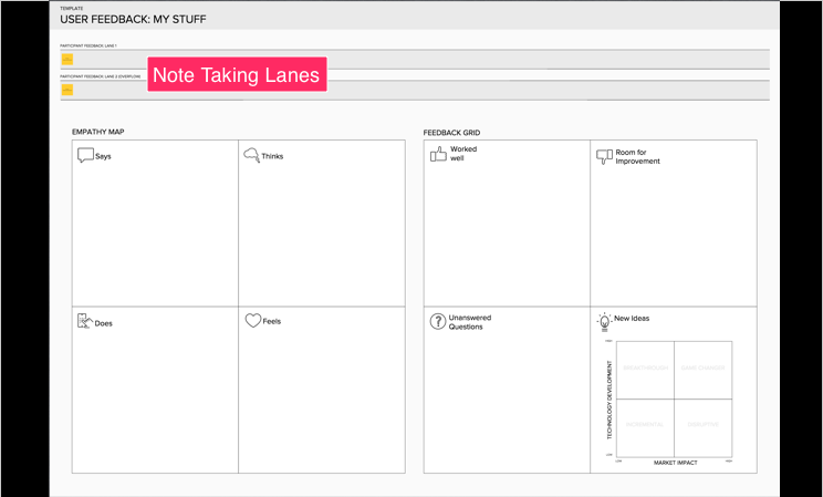
Taking all the potential opportunities into consideration, I start to map out potential concepts in MURAL that would ultimately speed up note taking and be more collaborative. Leveraging parts of other existing templates in MURAL I ended up with what you see below. I created 2 tracks to take notes for each session with the ability to organize the observations into the empathy map after each session. That way you would be able to start seeing patterns and themes much quicker than having to go through all data points at the end of the entire study or after several sessions for that specific day.
How this template would potentially benefit the team:
Enables the observer to not only quickly take notes but organize them at the the end of each session
A scannable overview of all the testing sessions
Can be used for future workshops focused on innovation
In Practice
The study was fast approaching and for this particular one, it would be located in Seattle. I’m located in Santa Monica and unfortunately I was unable to travel during that time so I need to work out a plan with the team to make sure we were able to keep the project moving and iterate on the outcomes quickly.
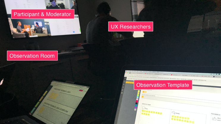
In order to make this a success, I discussed with the designer on a plan to head to Seattle and leverage the template during the sessions. I would be able to see the observations in real time and to start looking for themes and patterns even when I’m unable to observe the sessions live. I had a full understanding of the script and the prototype so I had all he context I needed to be able to understand what to look for.
The testing took place, here’s what we learned:
Ability to see live observations and which participant was being observed
Patterns emerge the more sessions that were completed
Continue to work on the feature and adjust designs as necessary
Observation Template In Action
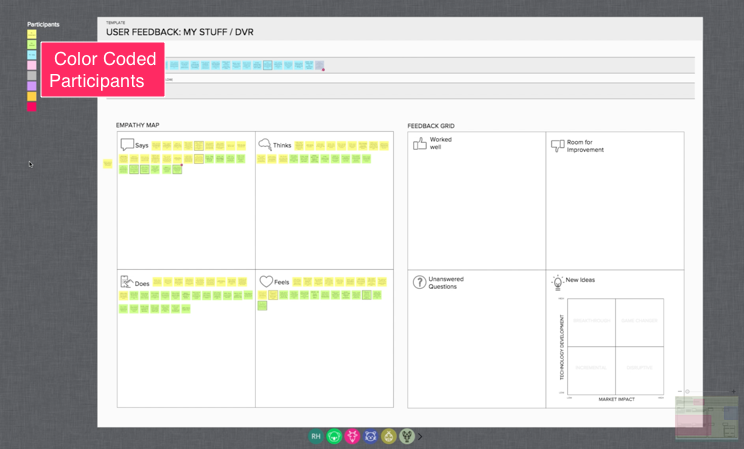
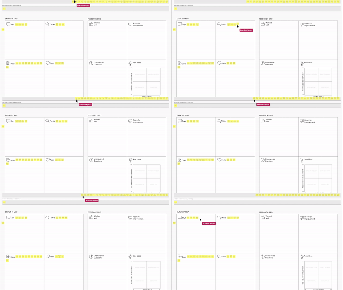
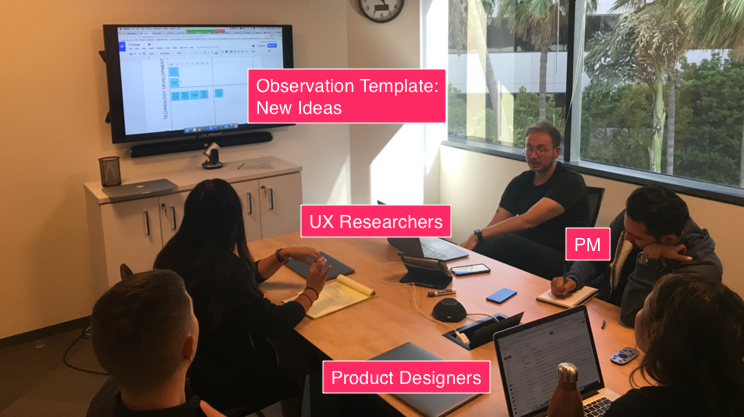
The MURAL canvas you can see above unlocked the ability to do 2 specific things that we were unable to do in previous sessions. The first was the ability to color coded the participants on the left of the MURAL for easy sorting and arranging. This gave us the ability to extract common themes per participant extremely quickly. We would add a thick stroke around specific observations to get back to them quickly for discussion points also.
The other was the ability to provide a shareable link (I believe it was Hipchat at the time) to anyone within the company to see the observations being created live. Below is a screen recording I took on my second screen whilst I was working on other areas of the project.
Seeing Feedback In Realtime
The Result
Here is the finished MURAL with all the participants feedback along with themes, patterns, some unanswered questions that we would ultimately follow up on and some new ideas/updates to the current prototype. All of this housed in one document which was one of the key opportunities I wanted to address. I was ultimately one click away from always having access to the raw data captured from the study.
The Outcome
Able to quickly sync with product, share our findings and adjust the tickets based on new insights
Ability to update the prototype immediately
Better understanding of my stuff/Cloud DVR
Living scannable document that we can always revisit
Can be used for all future testing sessions
Scalability
Low Effort/Low Cost
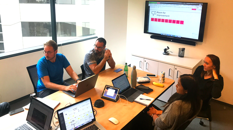
Here is an example of how we used the observation template to help gather feedback during a quick feedback session on some designs.
Only requires 5-10 minutes to set up
Focus more on the conversation
Ability to quickly iterate on the screens
Evolving the Process
After several studies, I facilitated a retro with the team to reflect on how the sessions were going leveraging this process and to identify actions for improvements going forward.
Key learnings from the Retro:
What went well
Much more collaborative between UX Research, Design and Product
Easy to organize the notes into themes
Themes and patterns emerged much quicker
Make quicker decisions
Ability to take notes much quicker during observation
Debriefs in MURAL were helpful right after the test to review all observations
Room for Improvement
No ability to quickly timestamp
Categories were too similar leading to indecisive actions of where to put specific notes
Limited to one participant at a time
Not enough time in between participants to organize the notes
Transitioning the notes to the empathy map took too long
Everyone still had individual canvases
Action Items
Iterate on the template to allow for multiple observers on one MURAL canvas
2nd Iteration | 2018
Onboarding Updates
In 2018, myself and the team worked on some key usability updates to the onboarding experience across multiple platforms. In order to make these key updates, we would need to run a number of studies to 1, understand all the major friction/drop off points after signing up and 2, why this was potentially happening in those specific areas.
Once we had identified some of those key areas, we wanted to quickly test out some of our hypothesies in the form of a new flow with a 3rd of the number of screens, updated language and logic.
After some time going back to the drawing board, I then landed on another template that ultimately solved having multiple observers on one canvas. The idea behind this template was to have UI screenshots of the flow we were testing on the canvas and then have multiple observers addressing specific behaviors for each screen during the session.
This concept addressed a number of issues that with had with the previous template, however, scale was still an issue do to small observation areas to take notes and flows being too linear. It was clear after a few sessions that I would need to go back to the drawing board.
What went well
Easy to follow the screens and comment in-line,
No need to organize the notes
Themes and patterns were relatively easy to place
Everyone taking notes on the same MURAL
Room for improvement
Initially hard to know which screen you were on when taking notes on the 3rd/4th participant
The flow was too rigid, especially if participants took another pathway
Limited space for notes for each screen
3rd Iteration | 2019-Present
Inspiration
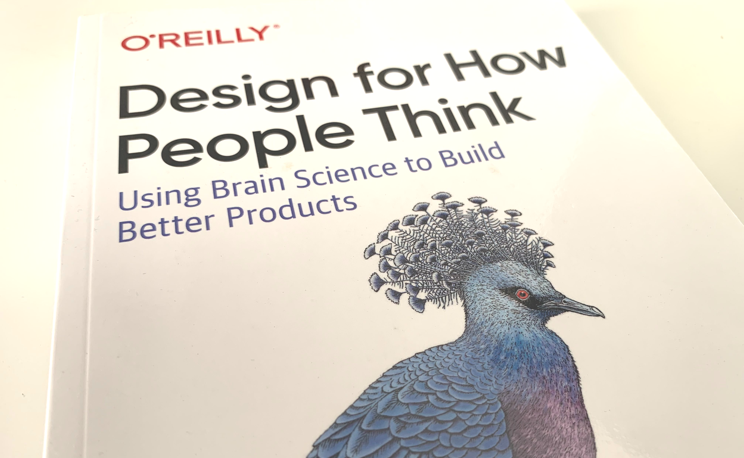
Design for How People Think
John Whalen, PhD
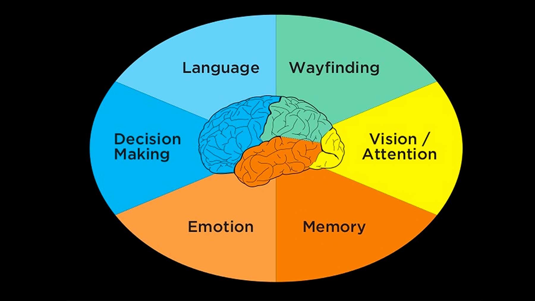
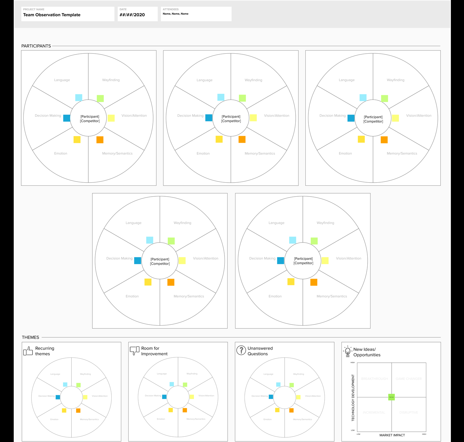
Last year I read a fantastic book by John Whalen called Design for How People Think which ultimately inspired the latest template that we use today. In this book, John explains that ‘an experience is not singular at all, but rather is multidimensional, nuanced and composed of many brain processes and representations. These mental representation being comprised of the following; vision/attention, wayfinding, language, memory, decision making and emotion. Together, they form the 6 minds of an experience.
If we are able to better understand how users think by leveraging these 6 cognitive areas, then teams should be able to create better experiences overall. Whalen ultimately introduces this so we can recognize these processes as we observe and interview people during usability studies.
This got me thinking..
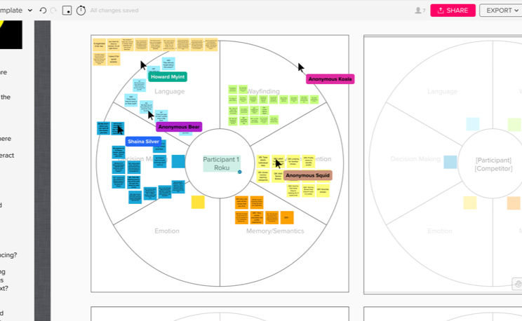
What if I take the 6 minds visual and adapt it to a MURAL canvas. Leveraging everything that I had learned so far with the other templates, it seemed like a pretty interesting idea and one that could really take collaborative observation to a whole new level.
Individual & Team Observation Templates
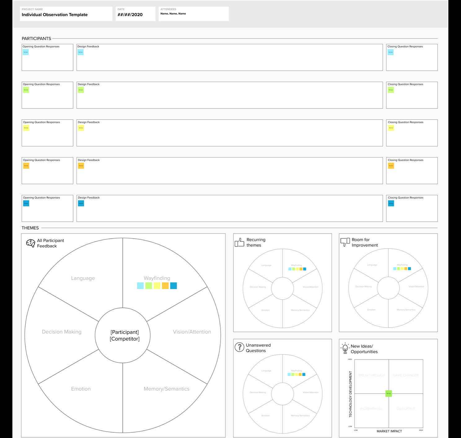
I decided to create 2 templates. One that was for smaller studies where you might only have one observer and one interviewer and the other for larger more collaborative studies where you may have multiple designers and researchers working together.
Individual
This template is specifically designed with one observer in mind. Through various learnings it’s much easier to simply take notes all up and not not have to think about all 6 areas at the same time. The observer has a lane for each participant (Up to 5) to take notes during each session. Once the study is over, you can organize the notes into the all participant feedback section.
Team
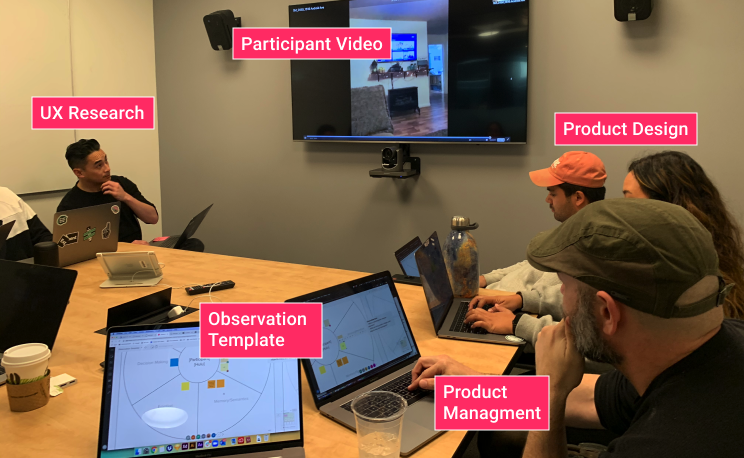
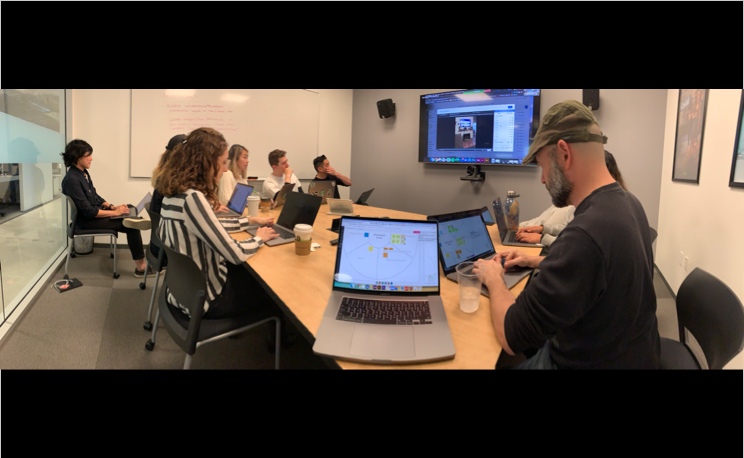
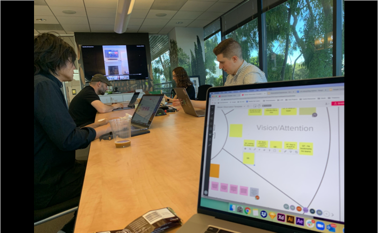
The layout for this template is designed in such a way that there can be multiple observers focusing on one of the areas for each participant. For one of our more recent studies, we had 6 team members spanning across research, design, writing and product taking notes at the same time on the same MURAL. What’s great about this is you can really focus on your specific area; language for instance if that is what you are observing and really dig into the themes and patterns emerging over time.
You can check out the templates here!
Templates In Use
The clip below gives you a general sense of how the data can be organized. Is it the prettiest? No, but being able to parse through the feedback quickly to hone in on specific observations is huge, especially in a remote environment when synthesizing the results with stakeholders, the executing team or perhaps both.
Reflection
In terms of design, the template is radically different from what it once was, however, the overall concept and spirit of how we are able to collaboratively observe users and take notes is still there. It simply took a fair number of studies and design iterations to get to where we are today but I believe it was worth the investment seeing how effective the template has bridged the gap between many teams such as design, ux research, ux writing and product management.
Part 2: Process
My next post related to this one will be more about the process on how and when to use the template. My main focus in this post was to discuss the origins of the template and provide some context on the iterations to get to where we are today, the pros and cons of each iteration and some of the scenarios in which they are used.
Thank you for reading and I look forward to sharing more details on the process soon.


